Repositioning Amilis as a confident, major player with a strong pharmaceutical foundation in the women's healthcare space.
Repositioning Amilis as a confident, major player with a strong pharmaceutical foundation in the women's healthcare space.
Overview
Directing the product and brand concept for repositioning Amilis in order to portray their huge pharmaceutical backing, whilst still being an approachable women's health provider.
Exercise
This rebrand exercise of Amilis is an expression of a "what if" moment. Factoring in my expertise in brand building, creative direction and digital design to showcase how far the Amilis brand could be pushed. I also aim to demonstrate how efficient and achievable this could be.
Concept
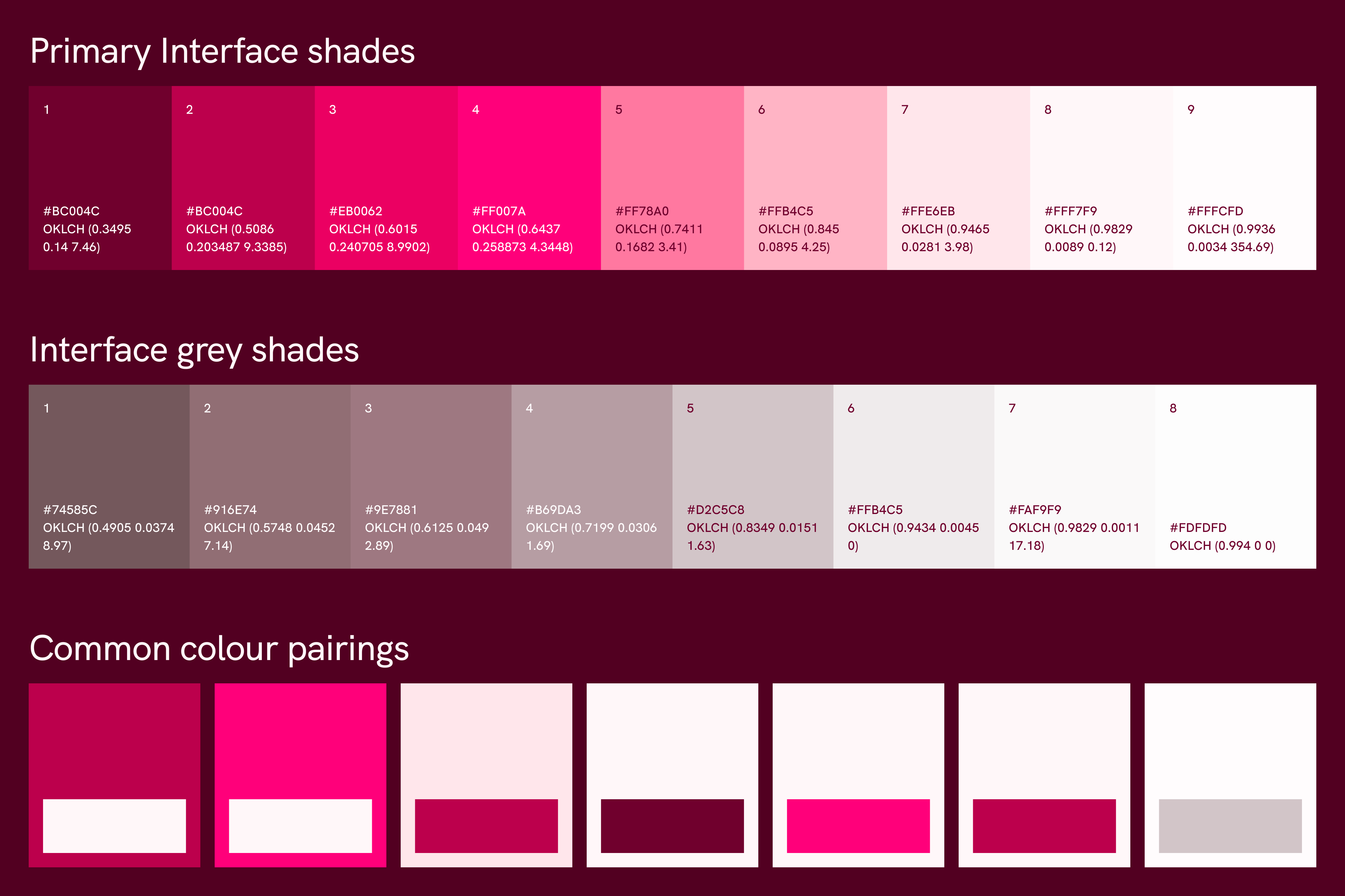
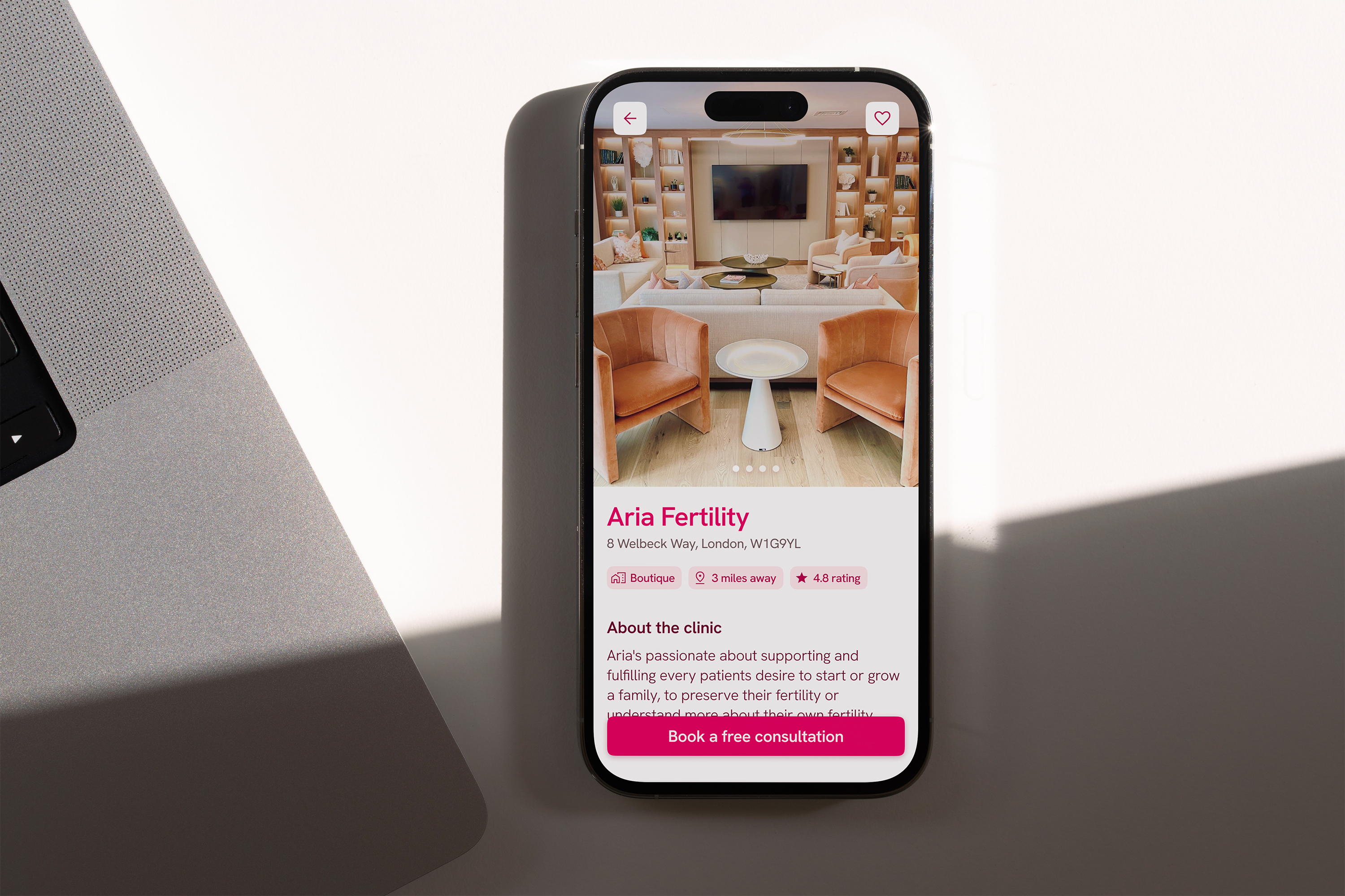
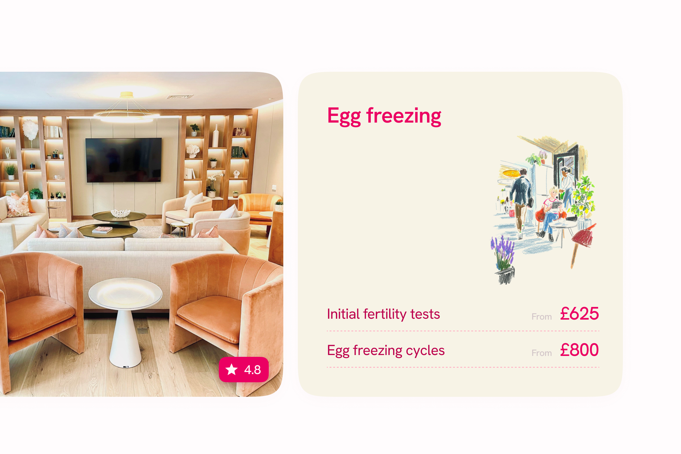
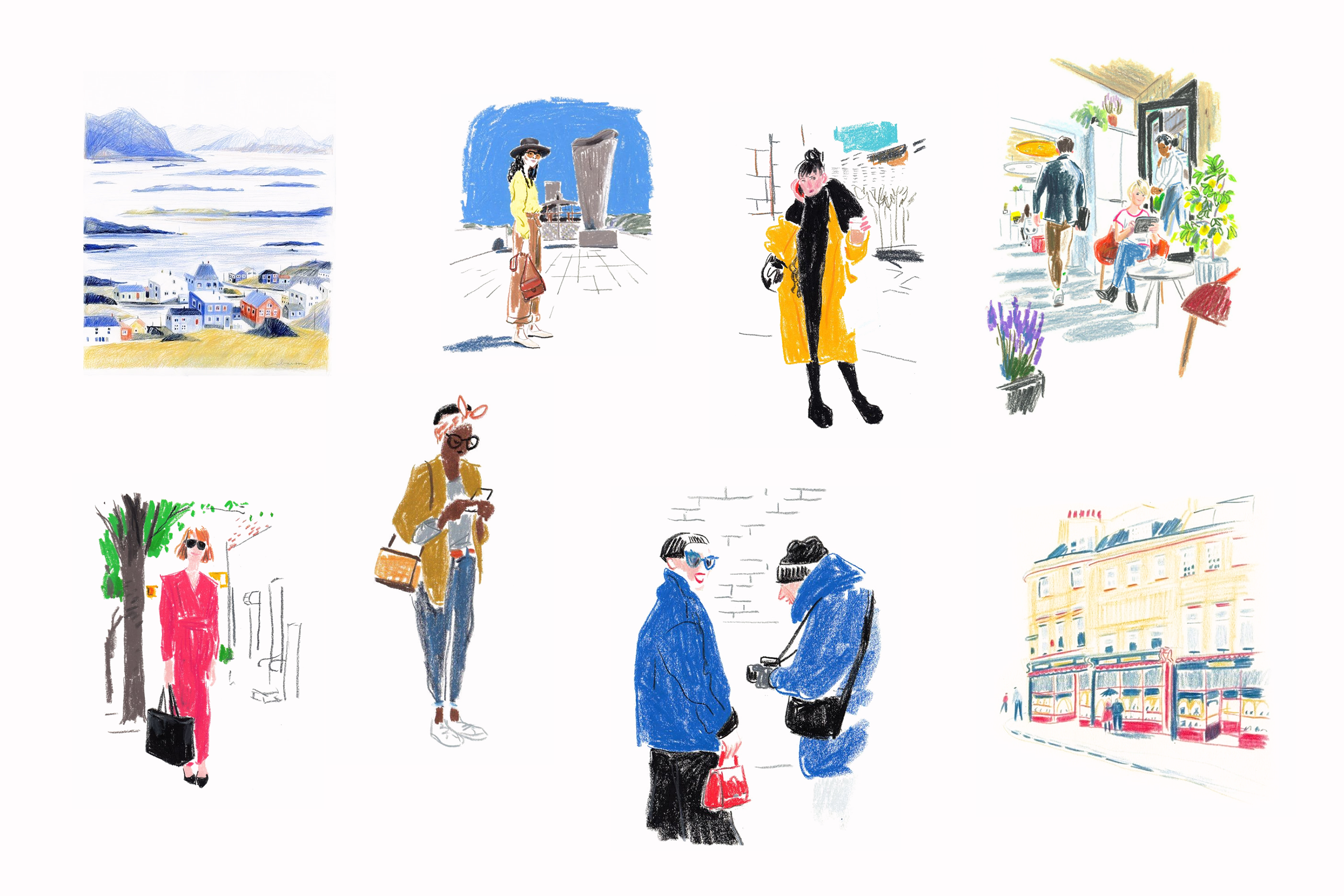
This concept aims to position Amilis as an approachable, professional healthcare provider by elevating core pillars of the brand visual identity; colour, typography, art direction and logomarks. I have also created an app prototype for a 'clinic search' listing feature, based on what's currently accessible through the Amilis product.
Logo concept
The idea of this logomark comes from the combination of two X chromosomes to signify female, which is merged together to create an abstract A for 'Amilis'. I then added negative space to the top paths of the two X's to amplify the A shape. The mark is then also matched in weight with the logo typeface to appear uniform and optically correct.

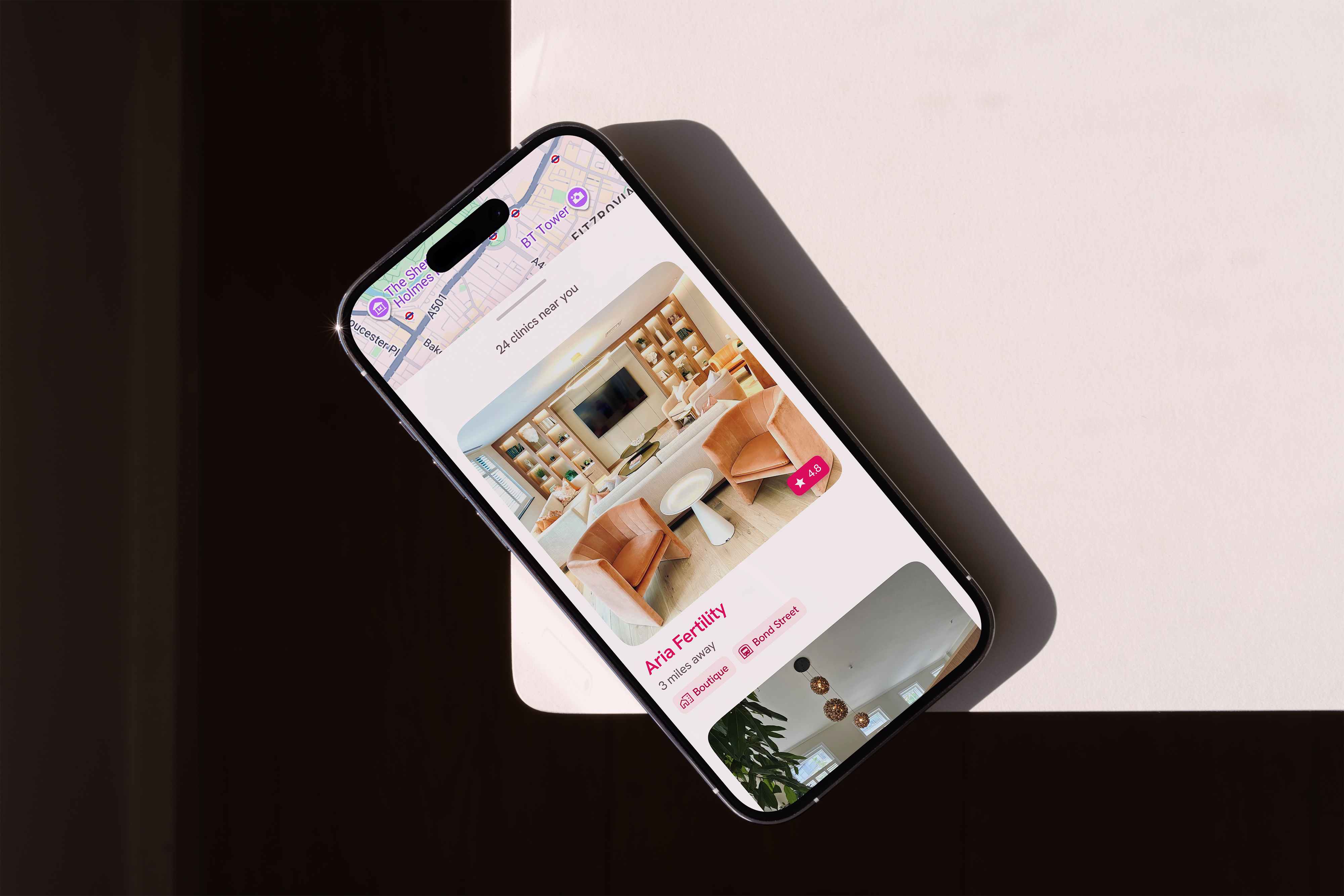
PROTOTYPE
Clinic search map and listings


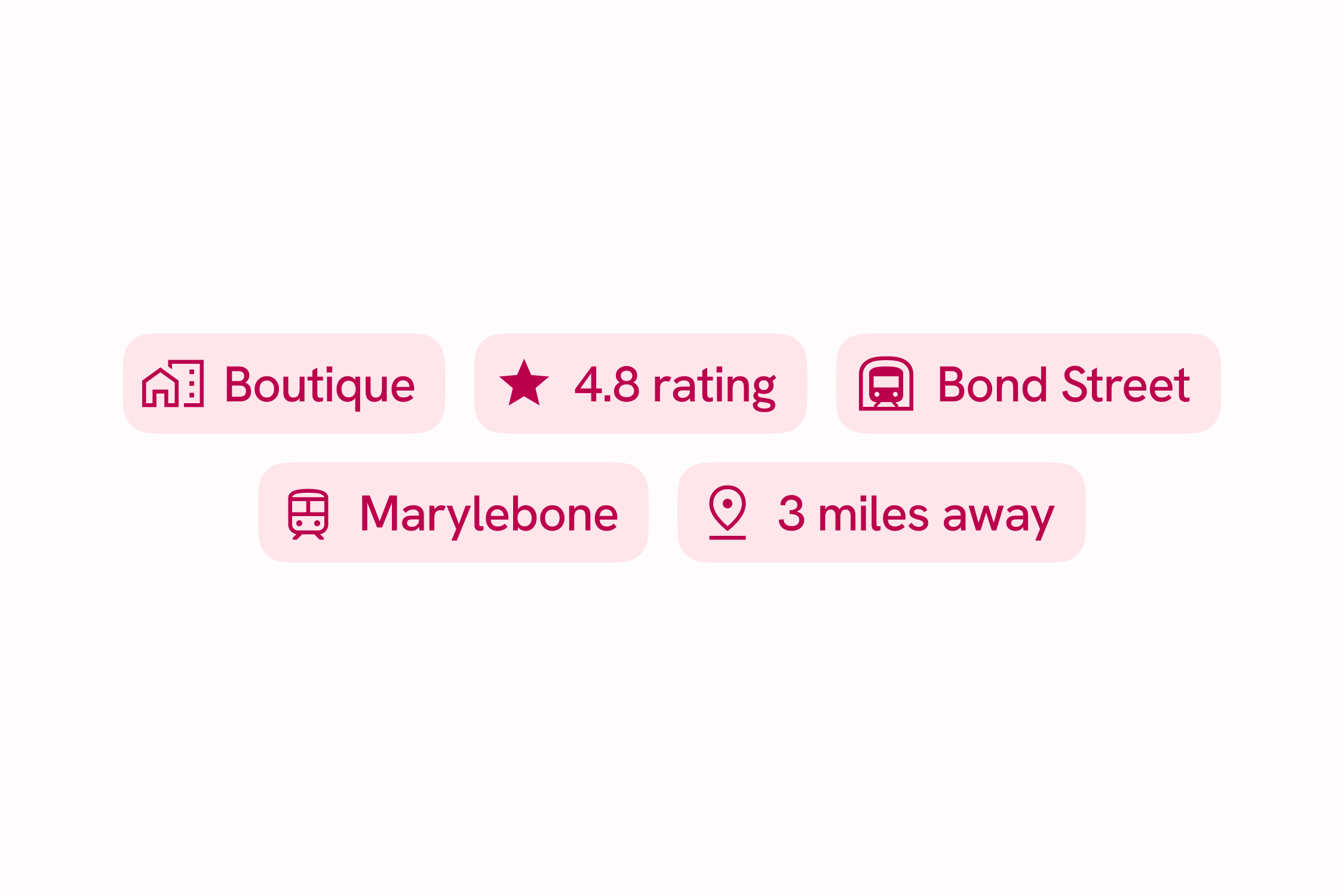
COMPONENTS
Atomised components preview
More projects
01

Leading the design of product and brand for Europe's most comprehensive reproductive healthcare provider.
02

A precision engineered bespoke typeface to spearhead Bicycle Therapeutics approach to targeting disease.
03


