A precision engineered bespoke typeface to spearhead Bicycle Therapeutics brand new approach to targeting disease.
A precision engineered bespoke typeface to spearhead Bicycle Therapeutics brand new approach to targeting disease.
Overview
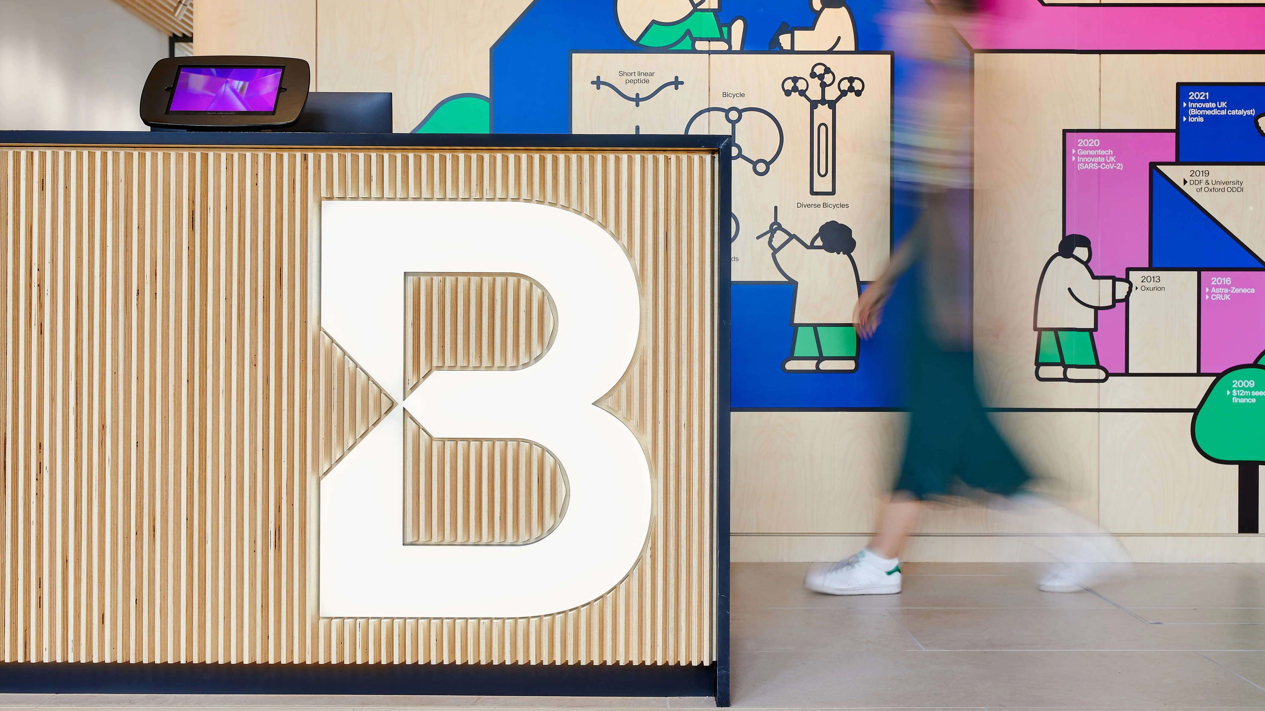
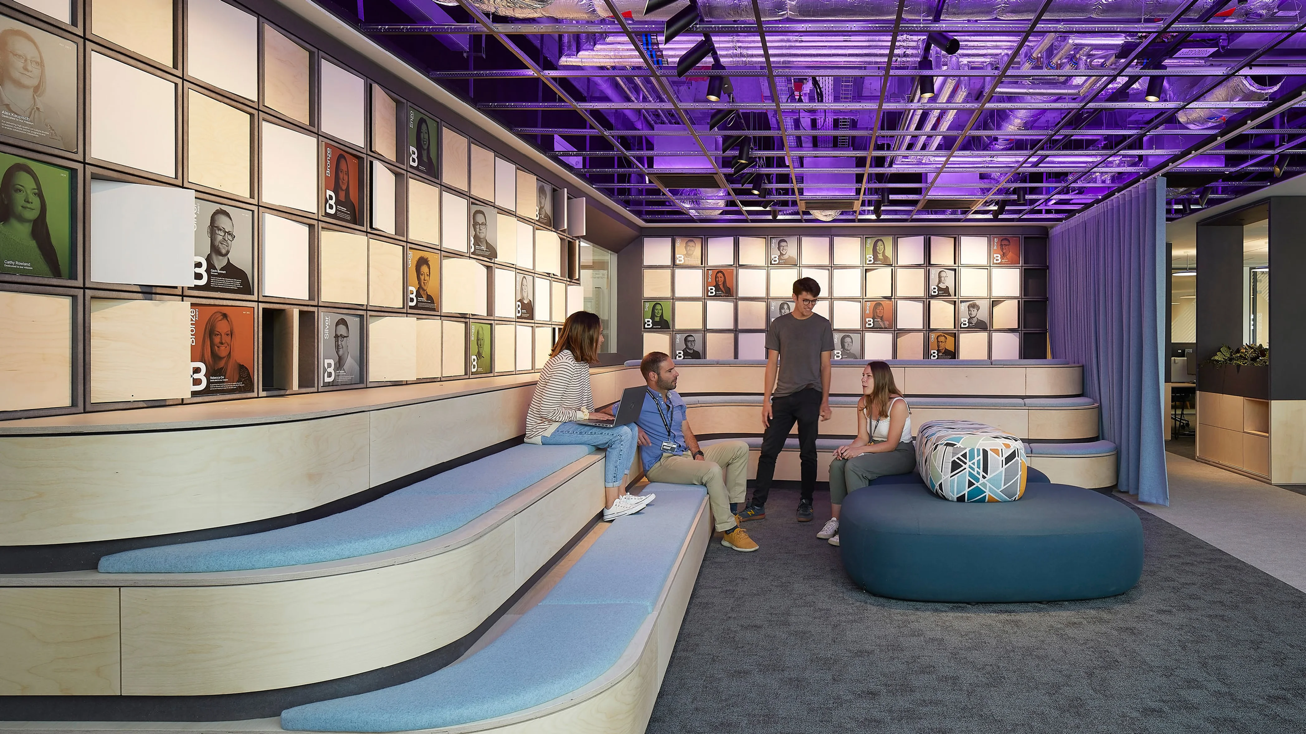
To signify an important milestone in innovation and growth, Bicycle Therapeutics required a rebrand which depicted their breakthrough in targeted cancer therapies.
Concept
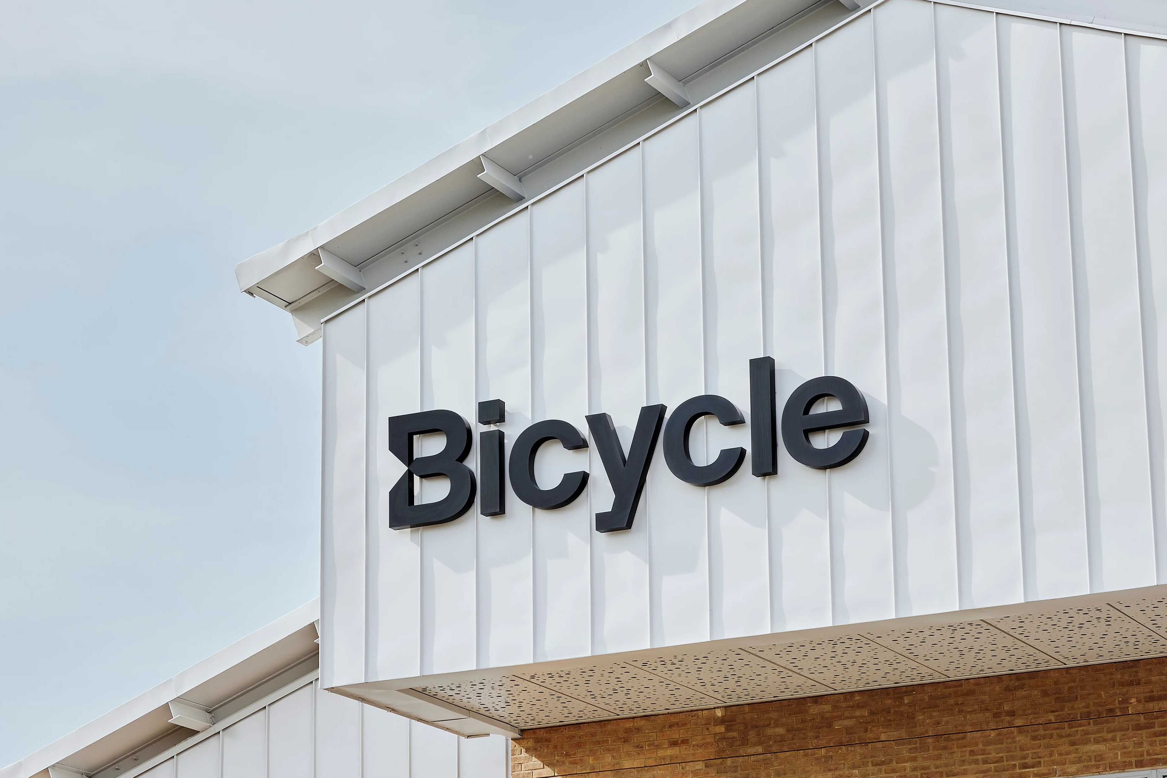
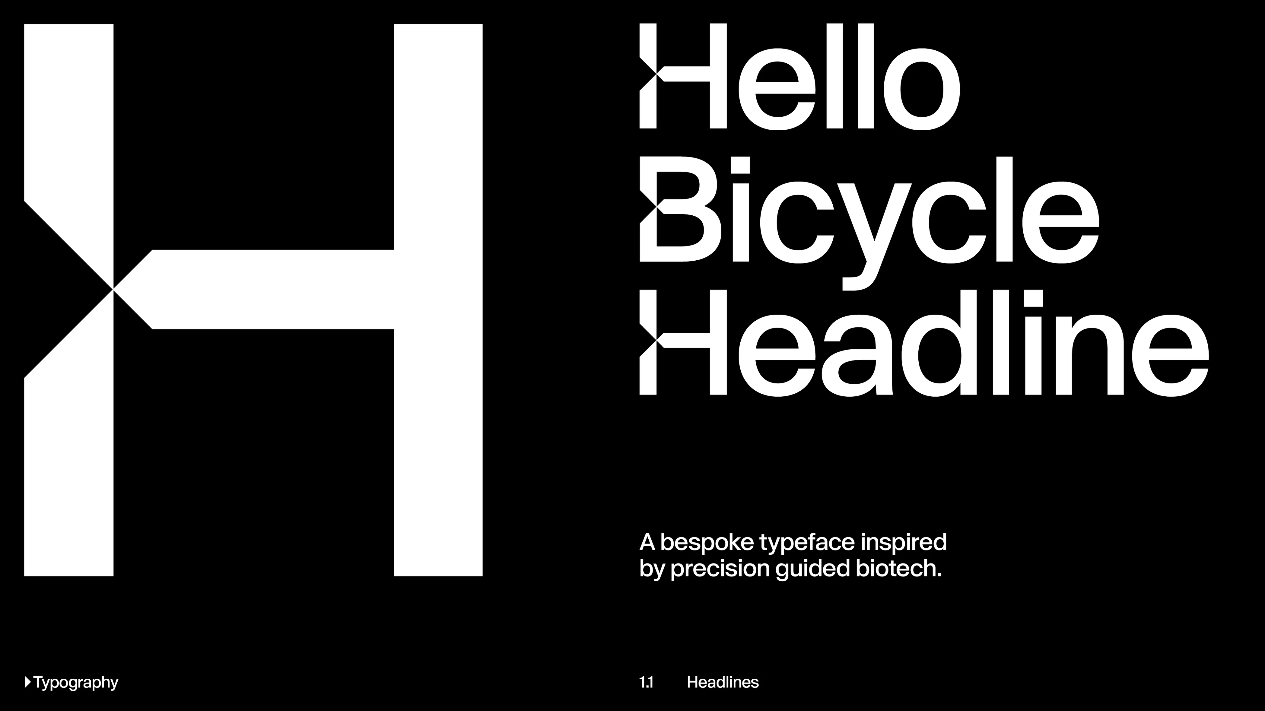
The phrase 'precision targeted therapeutics' acted as the guiding principal for the artistic exploration for the construction of the characters. The modifications are a direct reference to the scientific structure of a 'Bicycle' - and how this technology can 'intersect' and target it's designated area of deployment for therapeutical action.
Role
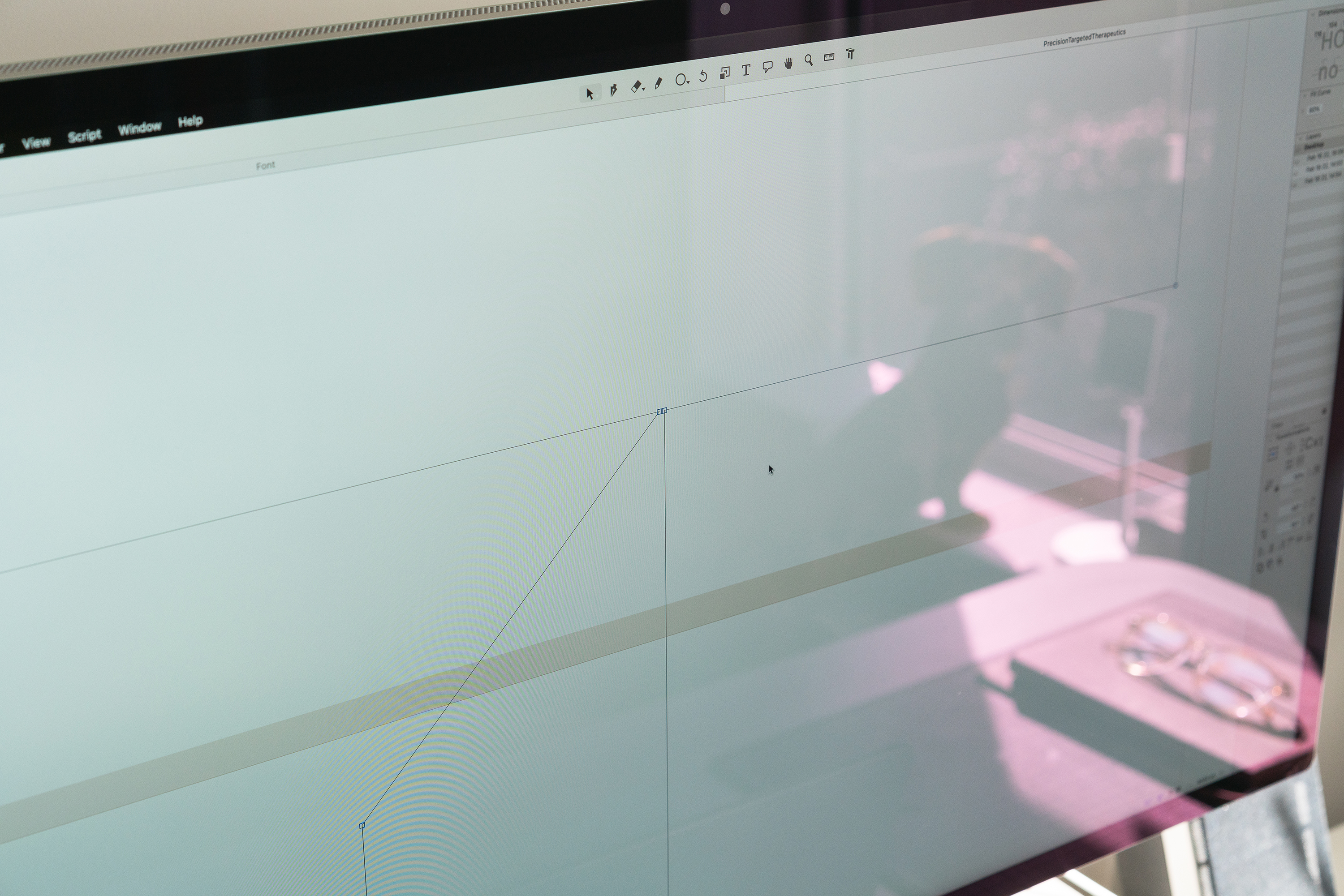
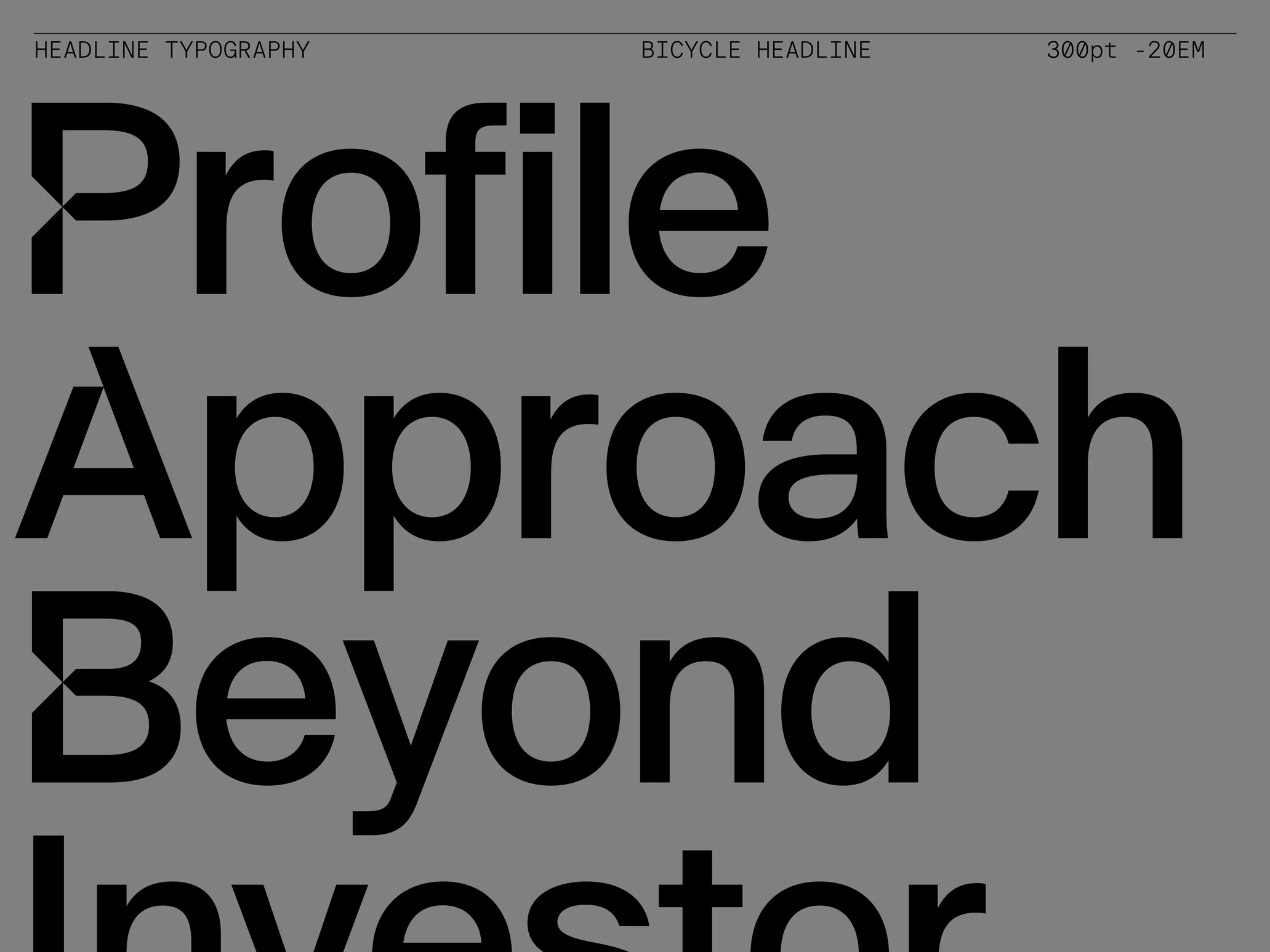
I was brought in by London based design studio The Green Space to work on the creation of a bespoke primary logotype and bespoke type family for a major rebrand of their client. The Bicycle type family consisted of matching display, body, italics and monospaced typeface variants to allow for flexibility in deployment across various brand applications.
Branding
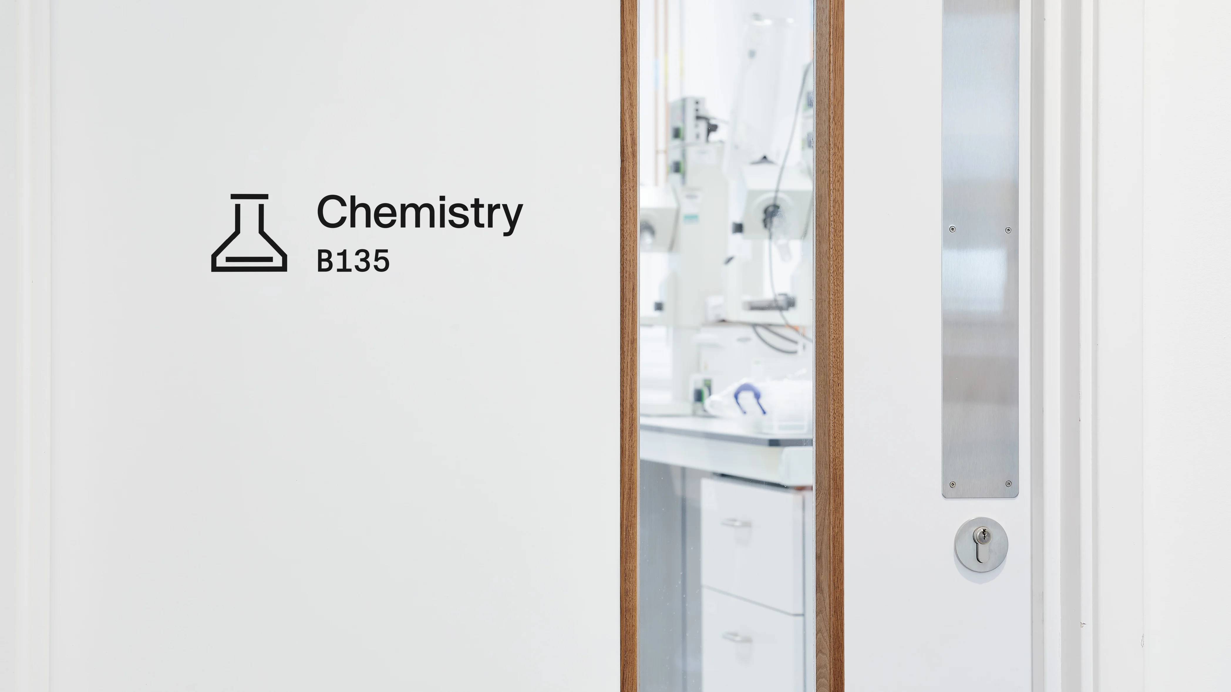
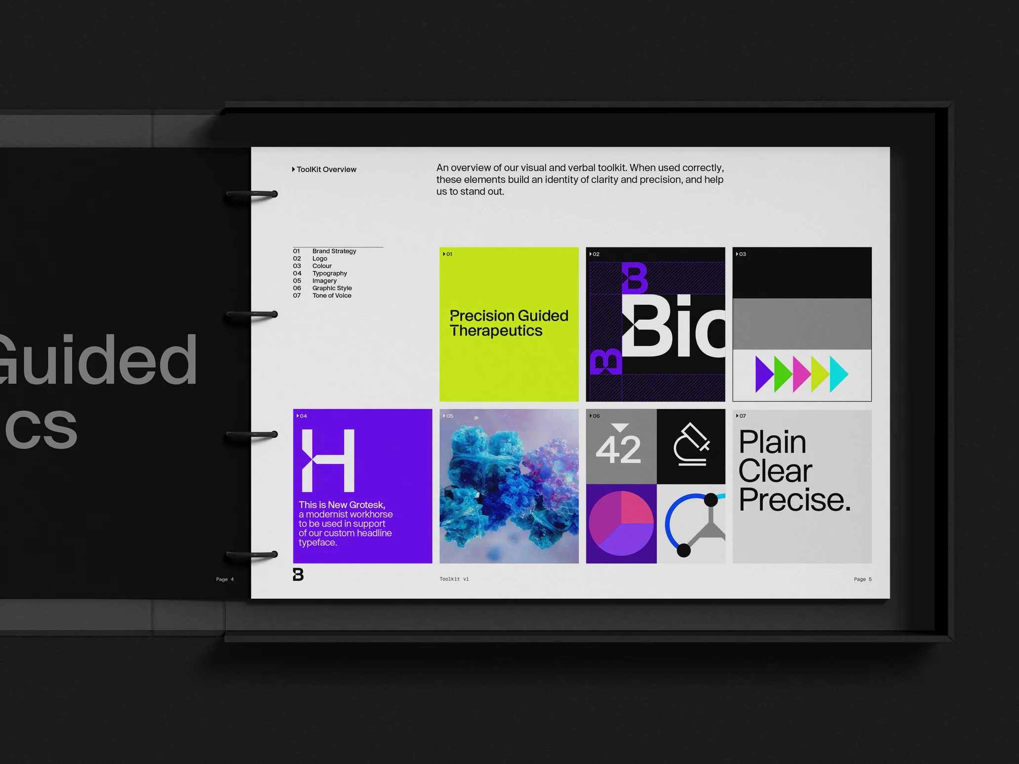
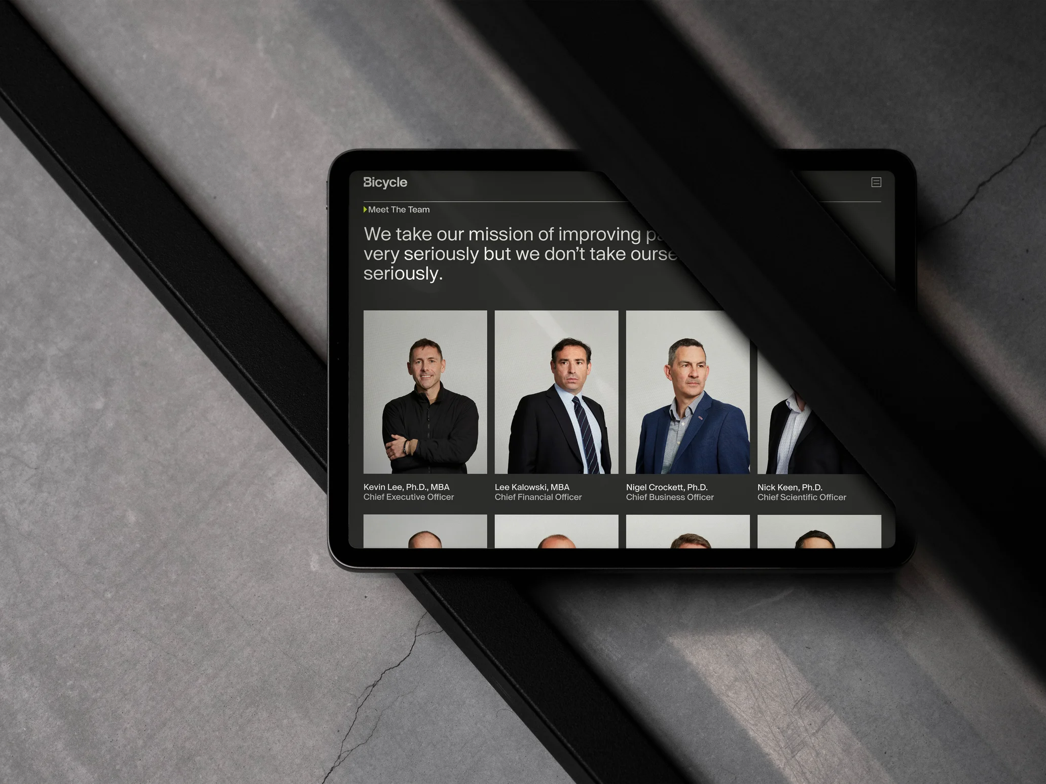
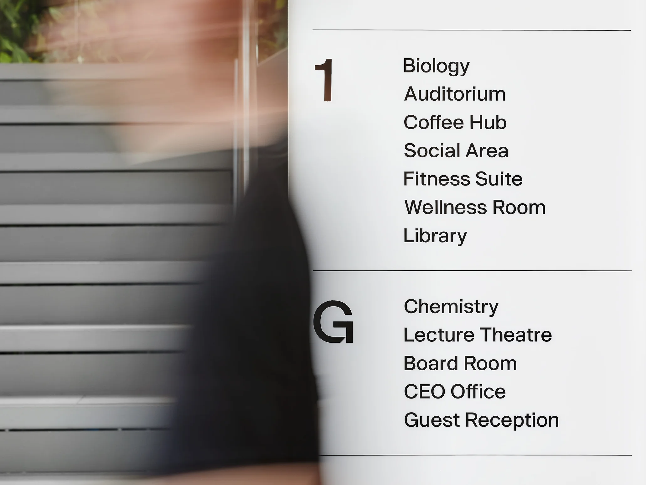
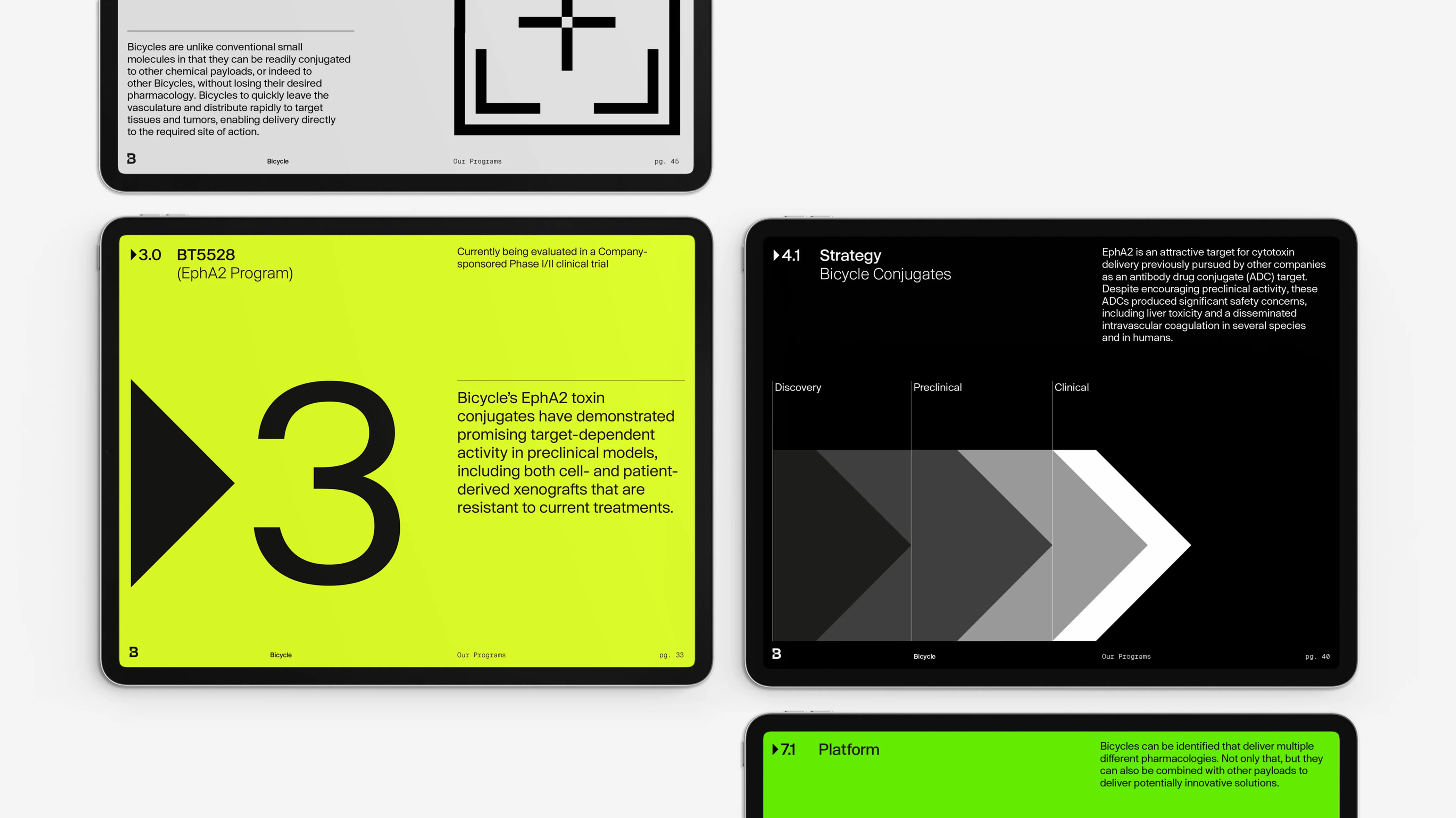
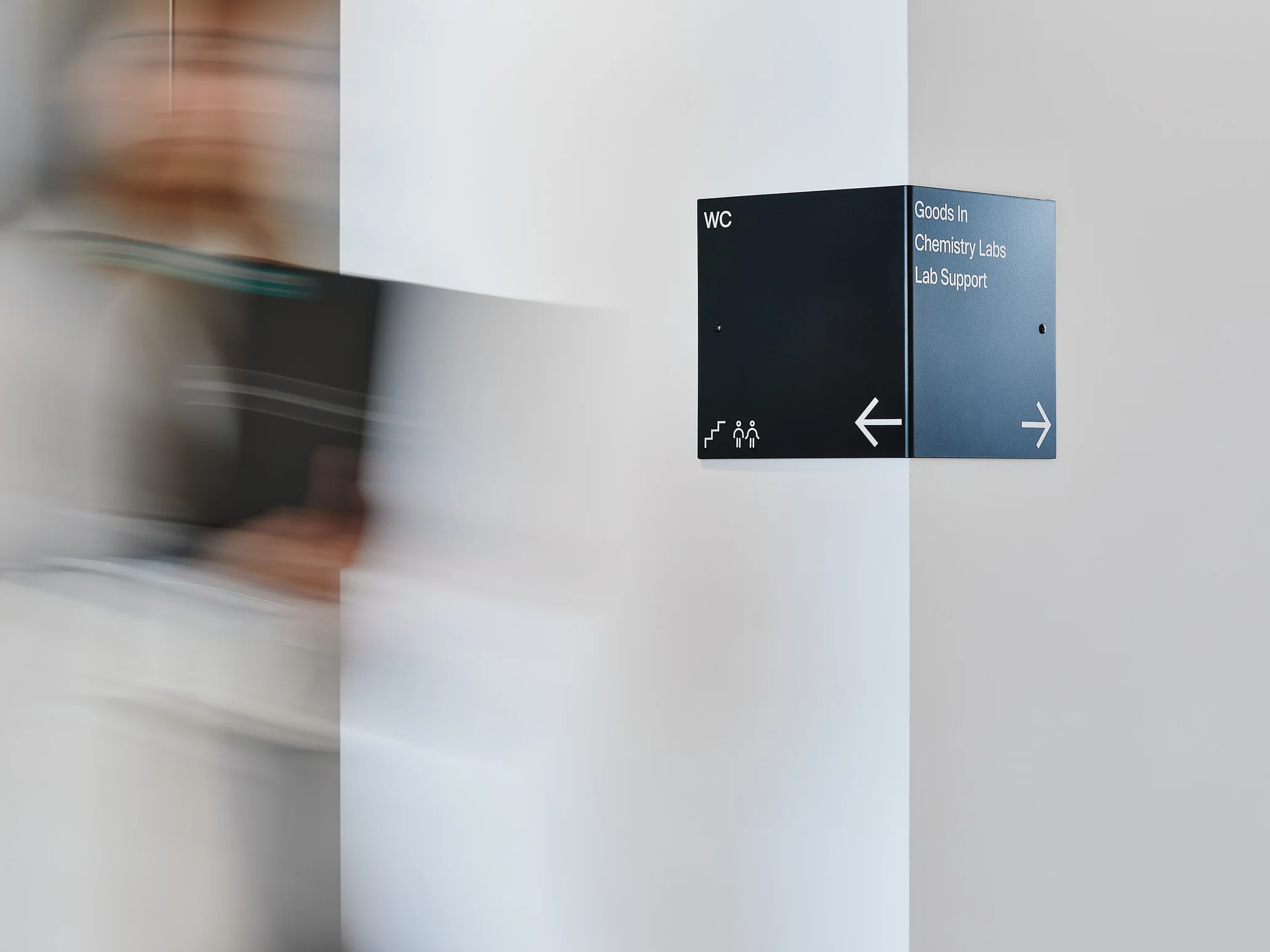
The Bicycle Therapeutics rebrand required an extensive set of deliverables. The new brand system needed to translate into various mediums such as interior design, way-finding, building sigange, scientific films and even uniforms.


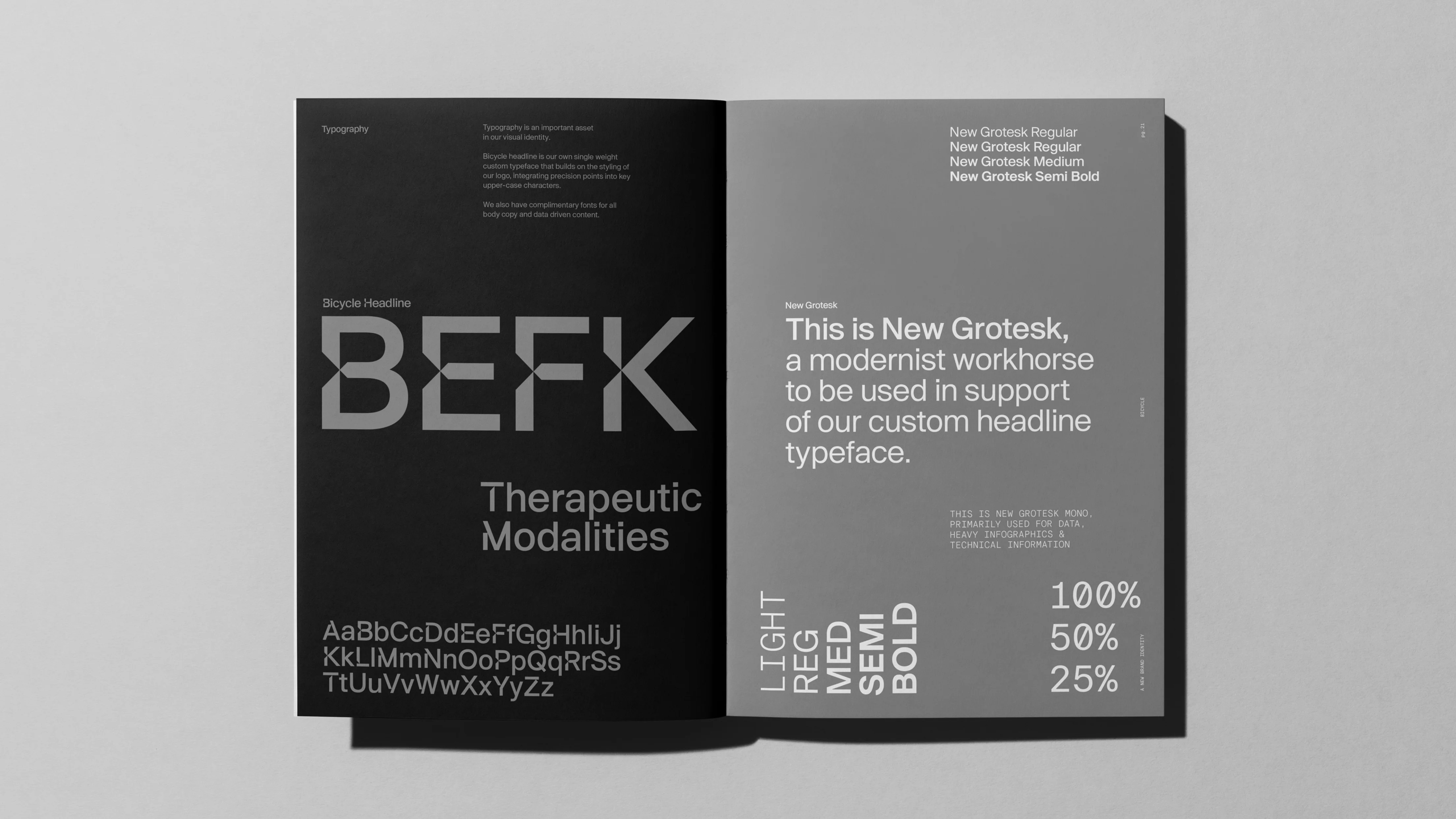
The construction of the main logotype was loosely based on one of my own retail typefaces 'New Grotesk'. Using this as a starting point I first created all the modifications for the main body typeface, and this helped to influence the proportions for the supporting display and monospaced variants.
The construction of the main logotype was loosely based on one of my own retail typefaces 'New Grotesk'. Using this as a starting point I first created all the modifications for the main body typeface, and this helped to influence the proportions for the supporting display and monospaced variants.


Design Studio
The Green Space
3D animation
James Brocklebank
Scientific CGI
Random42
Architecture
Pilbrow & Partners
Photography
Marcus Ginns
Henry Hunt
Illustration
Jing Wei
More projects
01
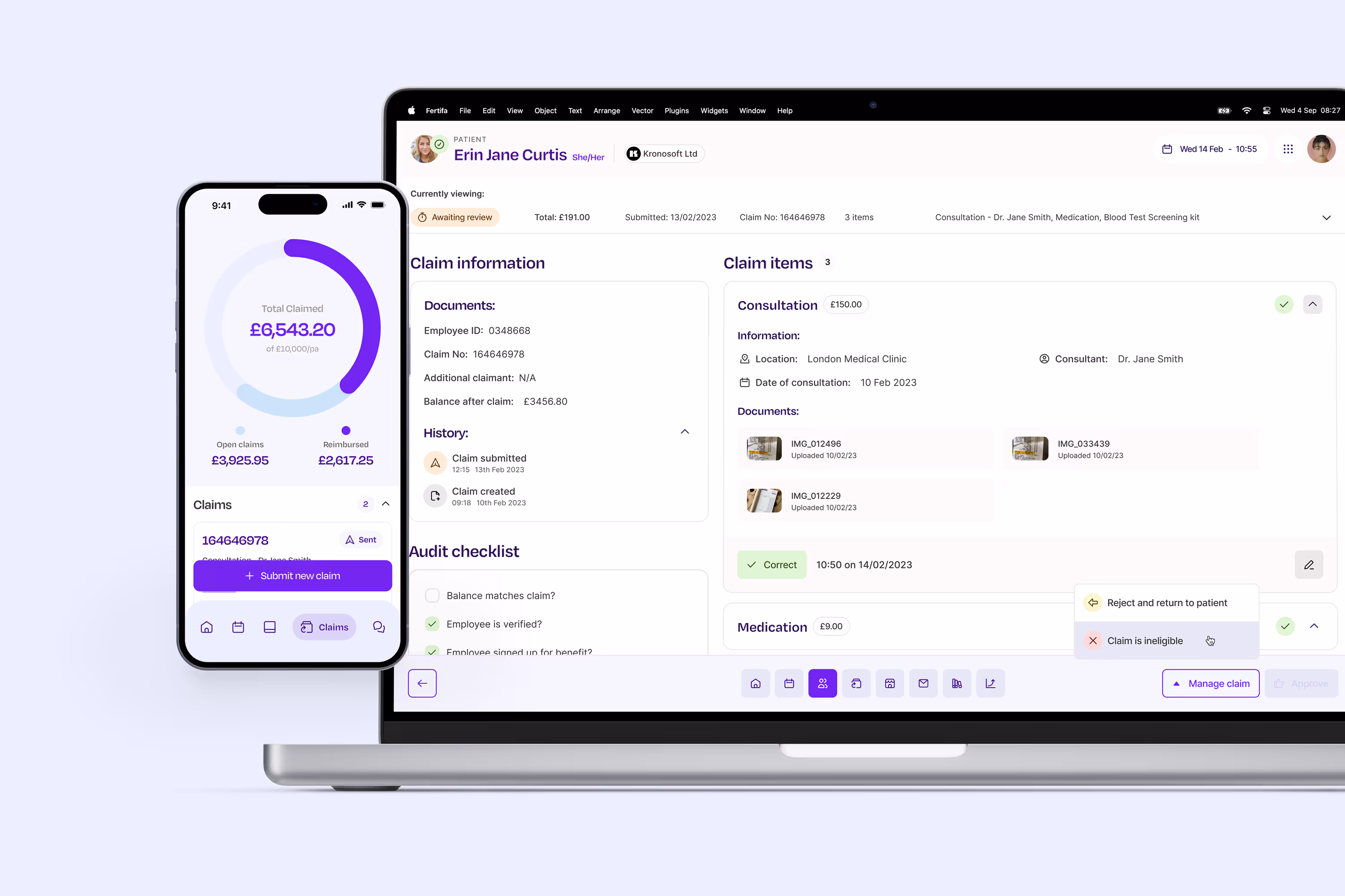
Leading the design of product and brand for Europe's most comprehensive reproductive healthcare provider.
02

Centralising data and finances with a unique look and feel for Round Treasury's first rebrand.
03
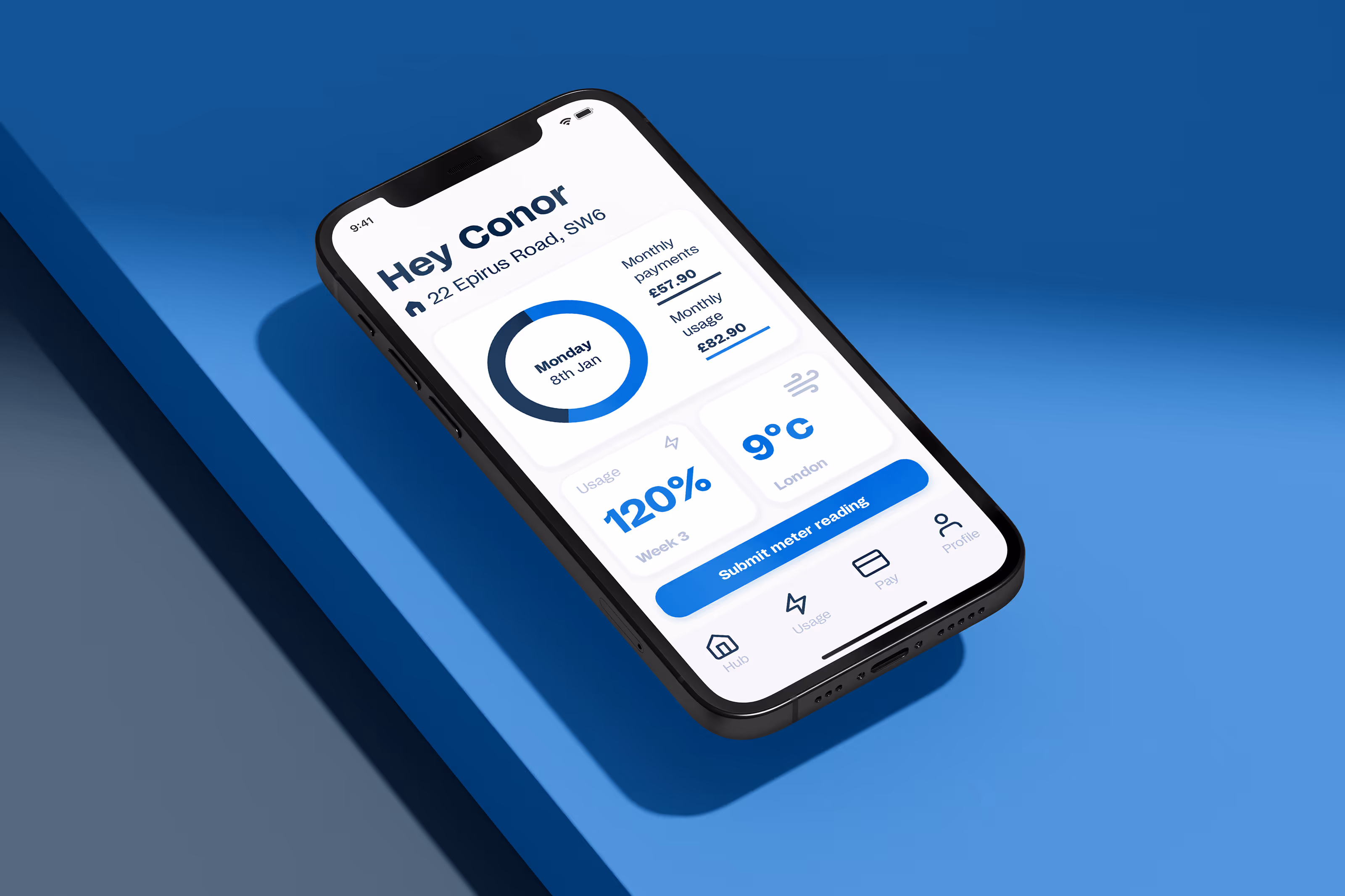
Introducing the first digital experience and a fresh look for Centrica's customer-facing Evolve Energy app.
Awards
Bicycle Therapeutics


