A new typeface and brand for Ce La Vi inspired by the theatrical drama of the South-East Asian kitchen.
A new typeface and brand for Ce La Vi inspired by the theatrical drama of the South-East Asian kitchen.
Overview
Working with OPX Studio (led by David Bennett), I was brought in to provide direction and create a bespoke typeface to help enhance the new rebrand of the South-East Asian luxury restaurant chain.
Role
Working closely with OPX Studio I provided direction on typographic branding, and created a bespoke cut of one of my retail typefaces for the client. This had to align with the main brand concept and would need to work in all deliverables across all restaurant locations globally.
Deliverables
The bespoke typeface acts as the glue which helps to pull all brand content together. The global rebrand of the restaurant chain meant that this typeface would need to work in interior design settings, corporate stationery, website, marketing content and in dining menus.
Creative concept
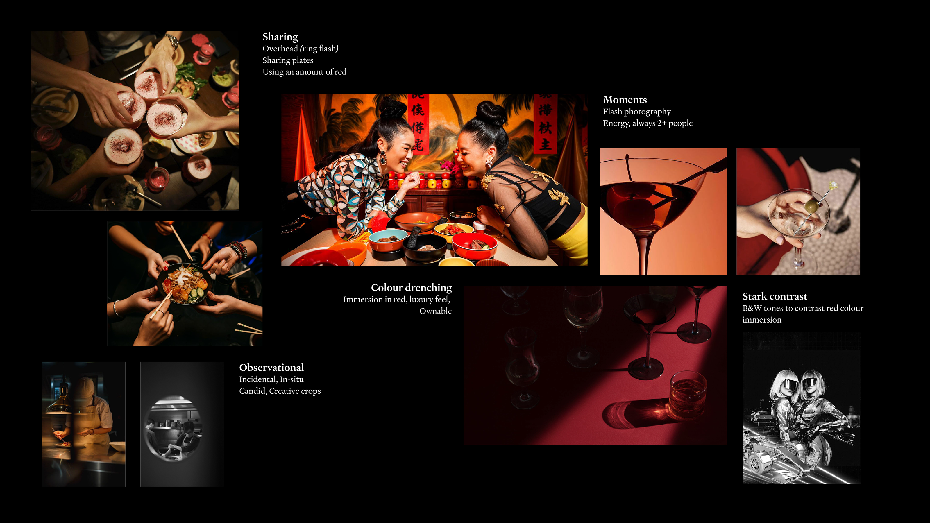
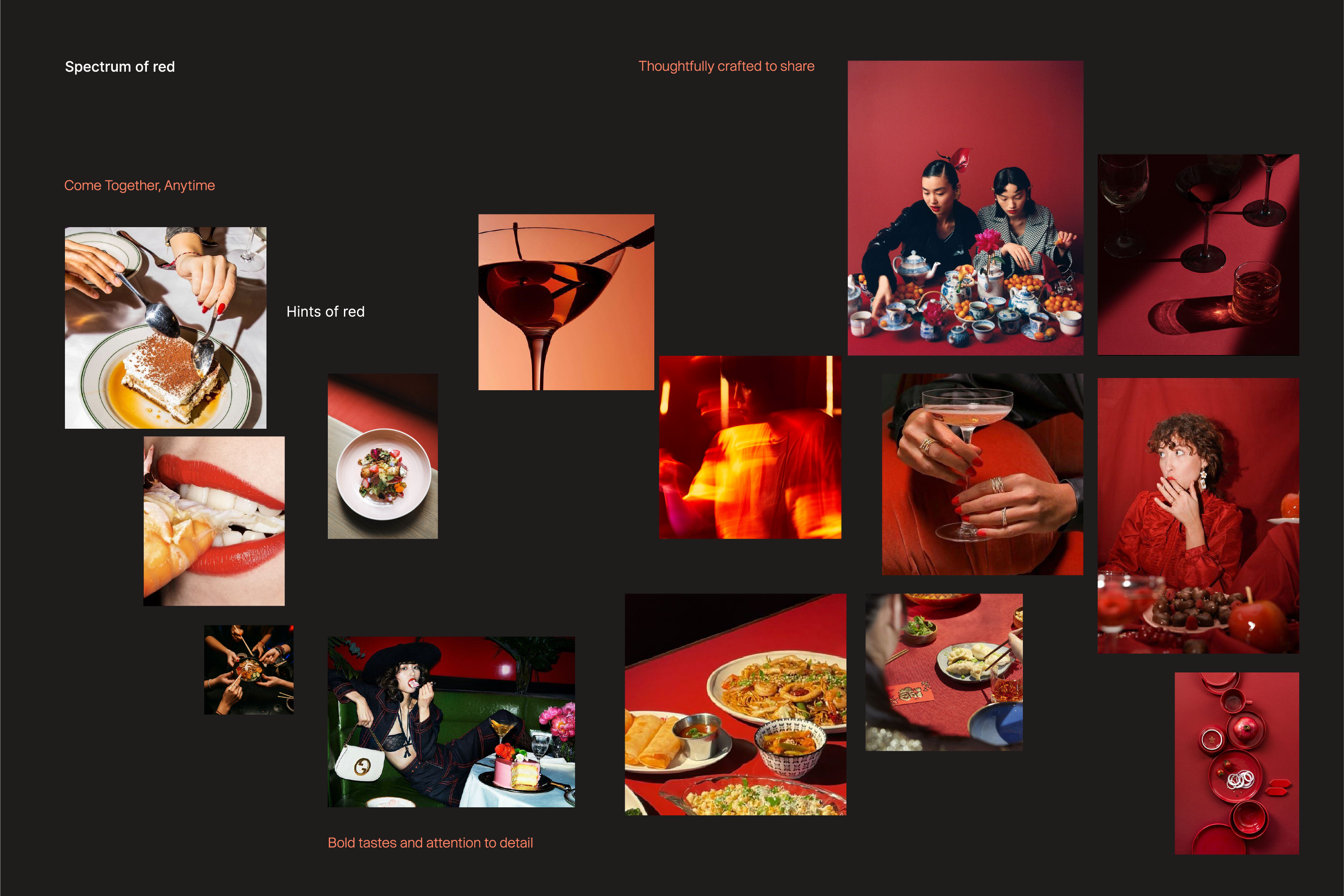
I initially wanted to refer to SE Asian culture without being too direct or cliche as the working brand concepts wouldn't support this. The lightbulb moment was when I thought I could create something which evokes subtle cues to cultural references such as high craft woodworking, architecture and the theatrical nature of the kitchen.
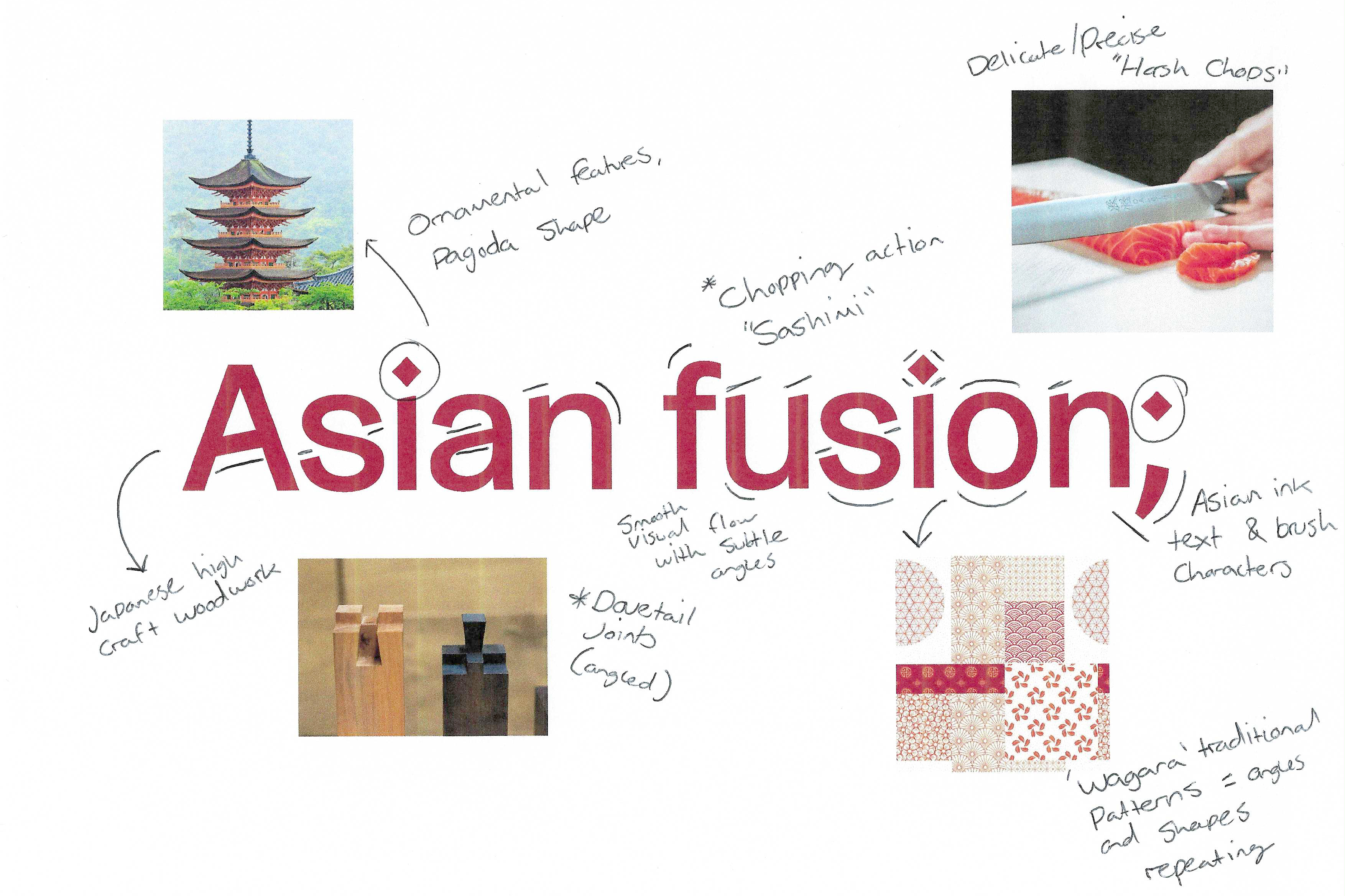
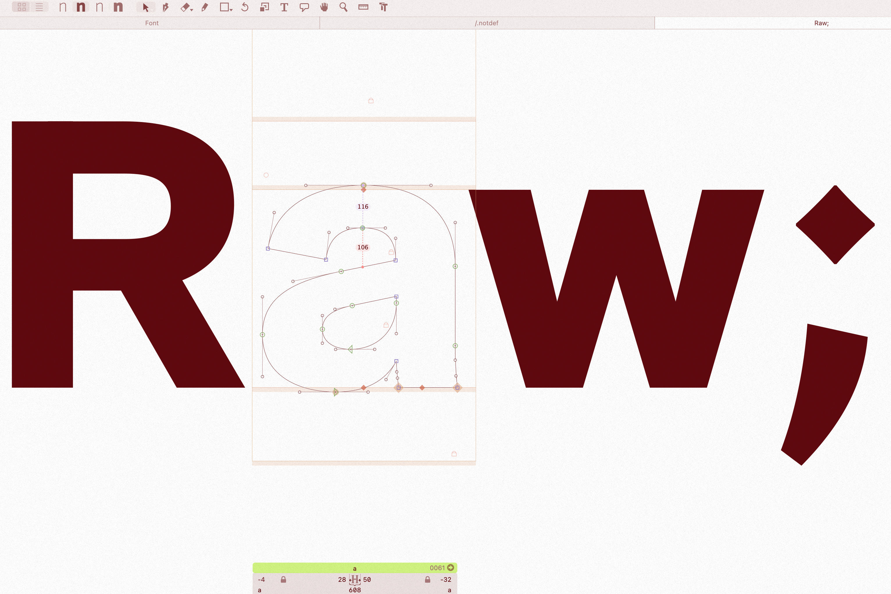
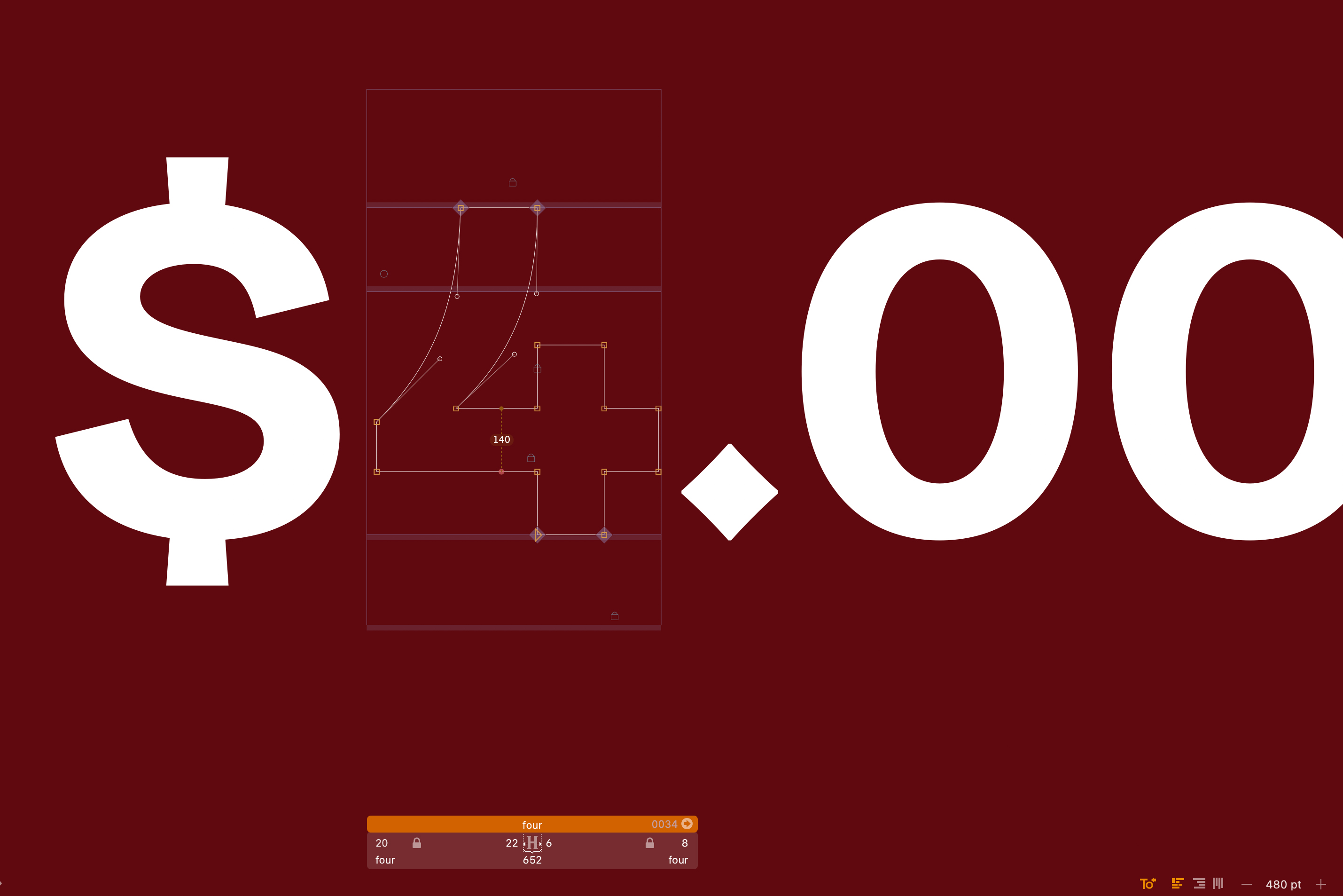


The paths of the letterforms also subtly follow natural brush strokes inspired by traditional scripts typically seen in Asian countries. These free-flowing references paired with the harsh 'chops' of the more rigid structures gave the extra drama needed to typographically support the brand proposal.


The paths of the letterforms also subtly follow natural brush strokes inspired by traditional scripts typically seen in Asian countries. These free-flowing references paired with the harsh 'chops' of the more rigid structures gave the extra drama needed to typographically support the brand proposal.

Before
After


Design Studio
OPX Studio
Direction
David Bennett
Client
Ce La Vi Restaurants
More projects
01

Leading the design of product and brand for Europe's most comprehensive reproductive healthcare provider.
02
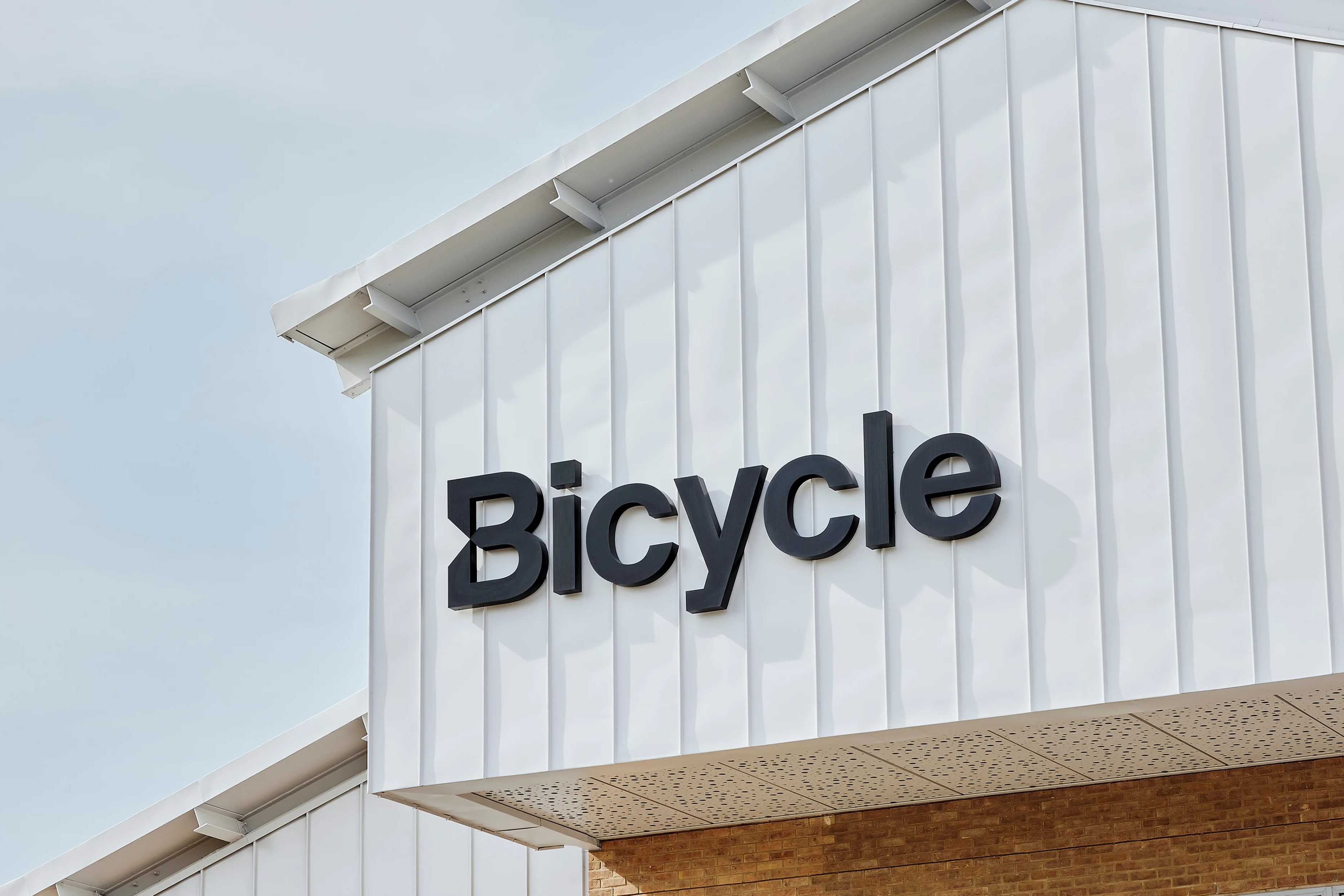
A precision engineered bespoke typeface to spearhead Bicycle Therapeutics approach to targeting disease.
03