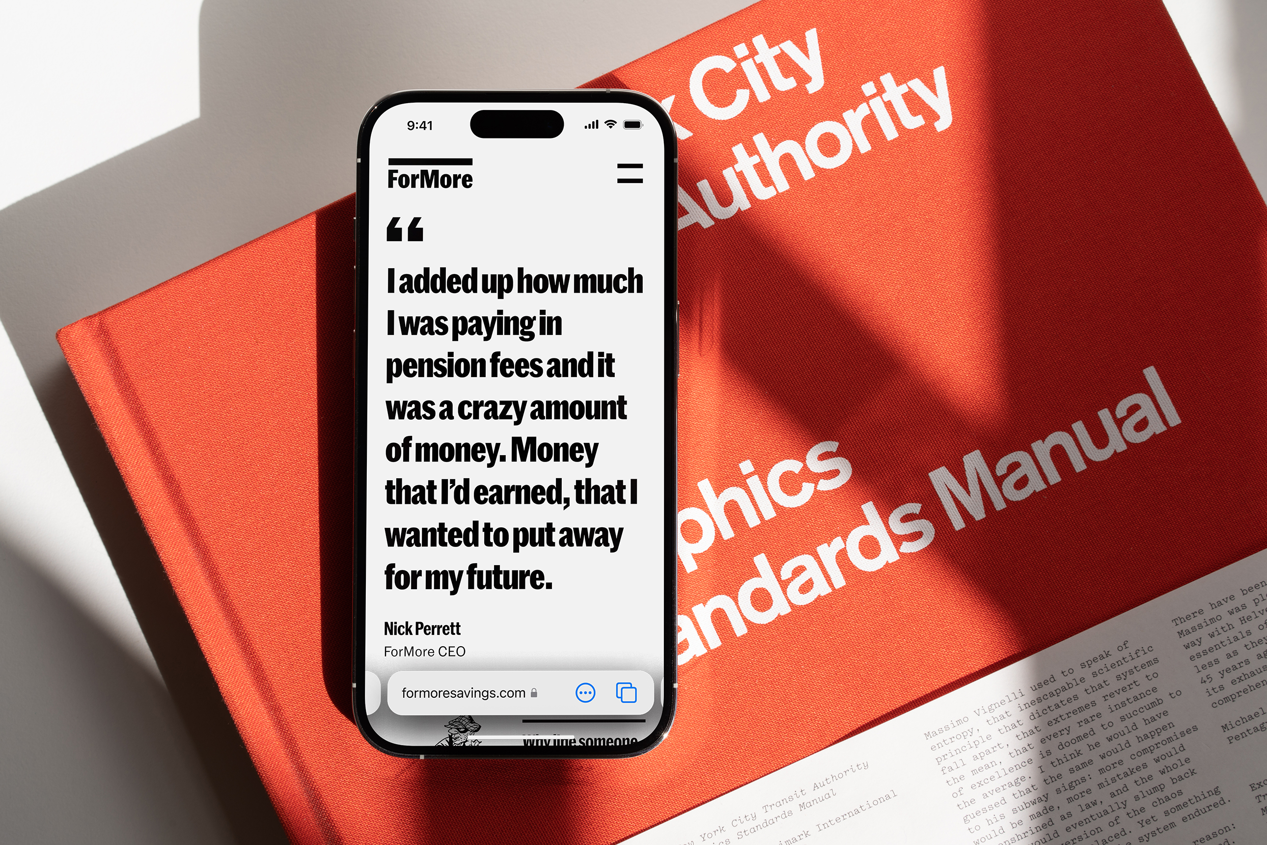
This revolutionary new pension platform deserved a bold online identity to challenge the industry norms of later-life savings.
This revolutionary new pension platform deserved a bold online identity to challenge the industry norms of later-life savings.

Overview
ForMore is a revolutionary pensions platform startup which provides exclusive access to fee-free investments allowing users to save more for later life.
Deliverables
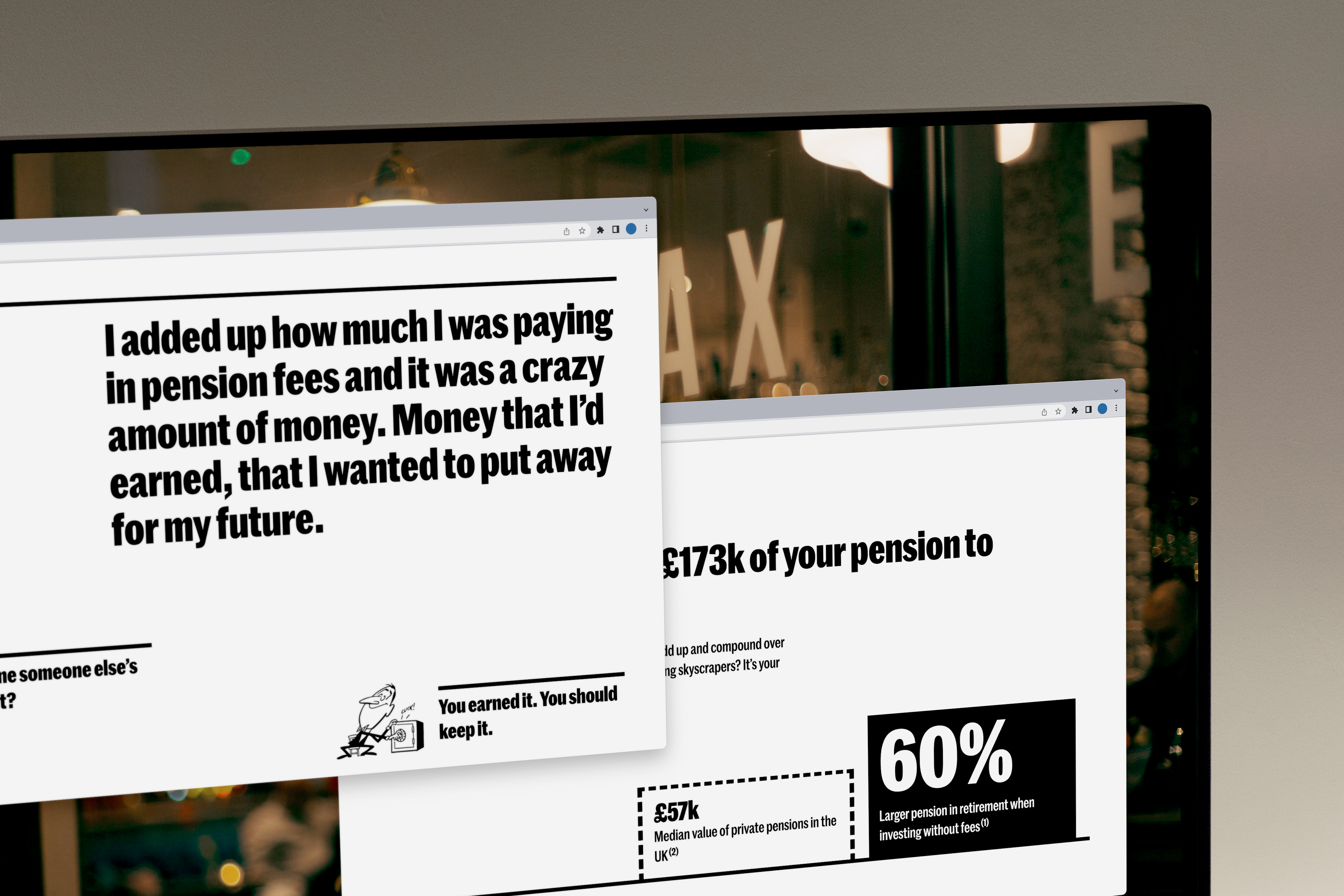
I worked with ForMore to extend their existing brand guide into something suitable for an online presence. This resulted in art directing and designing the pages for their new marketing site, which I later developed in Webflow.
Role
Global design studio 'Reason' were in charge of the account and providing brand guidance. I worked as main designer on the project and I worked collaboratively with the ForMore product design team to ensure alignment on digital output.
Branding
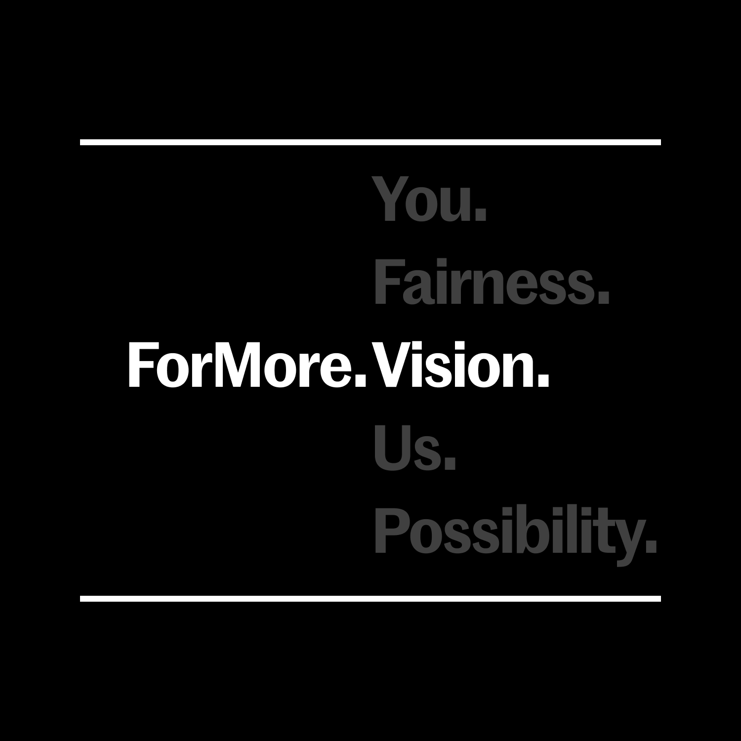
The ForMore brand relies on bold typography-heavy visuals, simple colours and quirky illustrated mascots. I wanted to capture this in the page designs by creating strong, interactive text elements, graphs, USP's and no-nonsense product imagery.
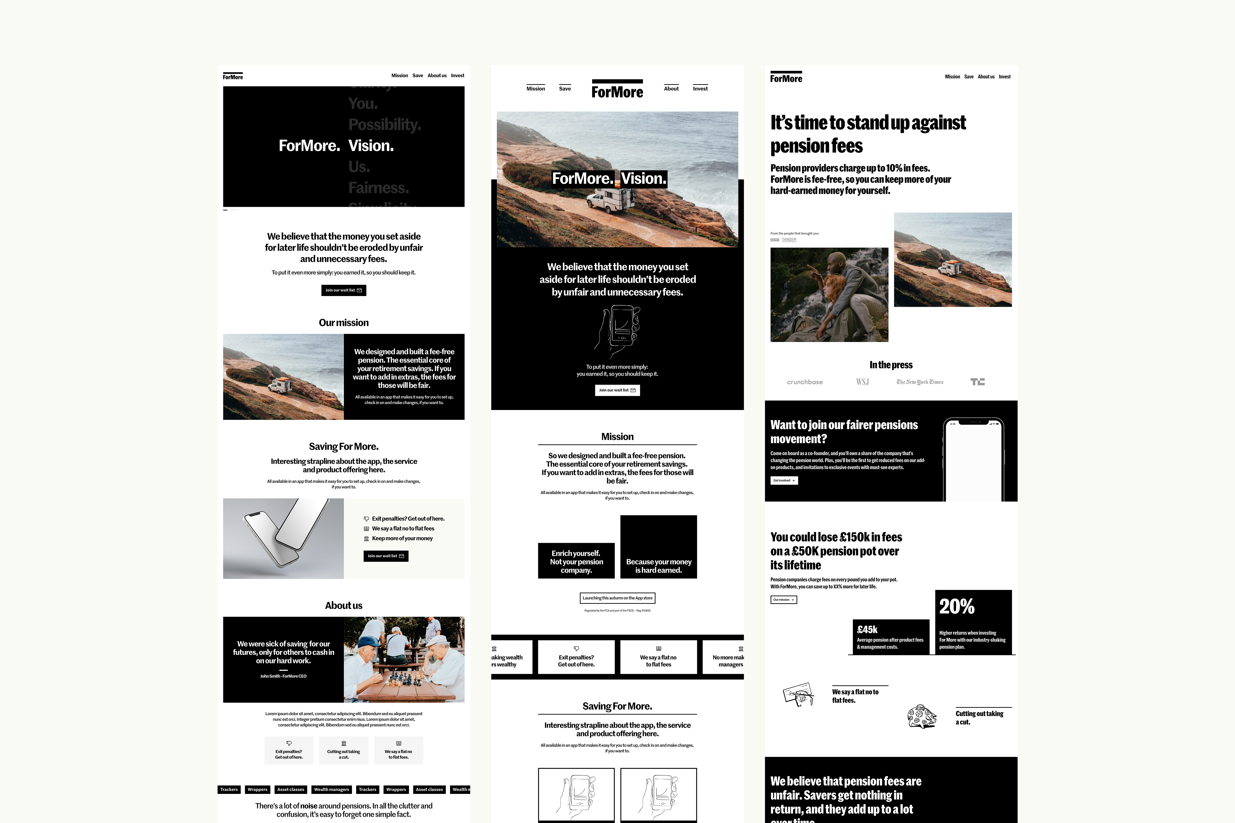



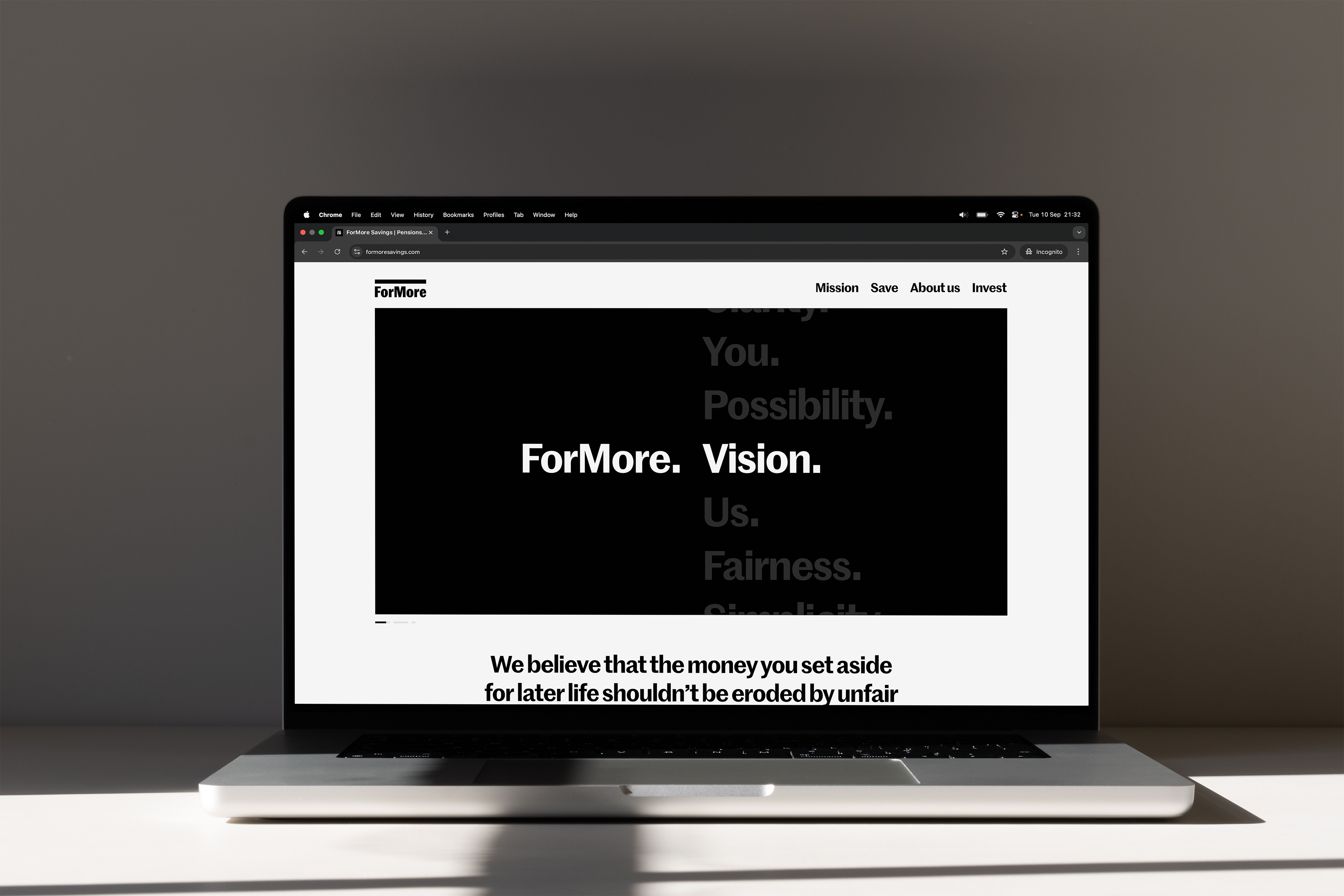
Building the site in Webflow allowed me to efficiently develop the pages and easily create interactions. Webflow also allows for an easy handover to client with it's simple editing abilities for product owners.


More projects
01
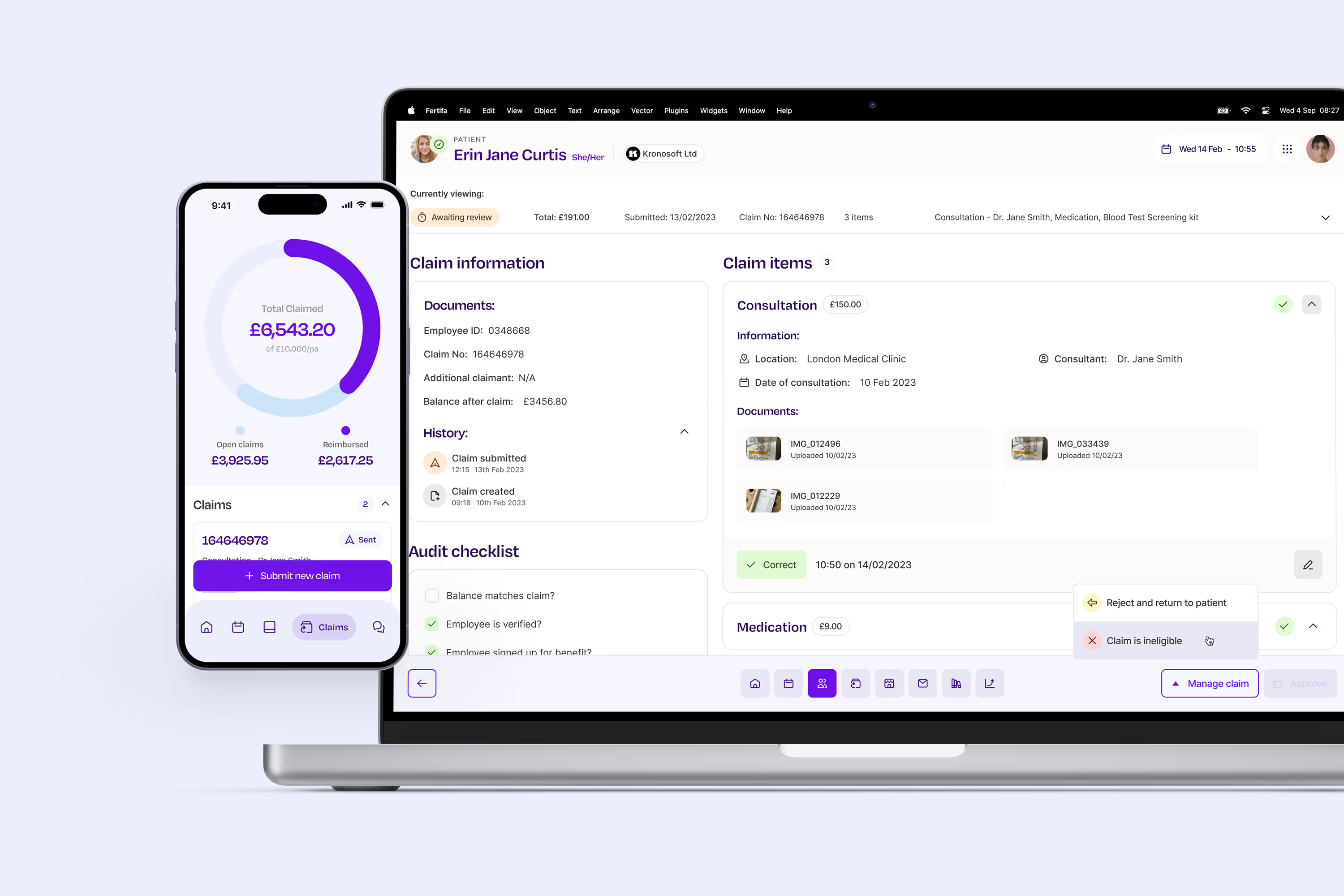
Leading the design of product and brand for Europe's most comprehensive reproductive healthcare provider.
02

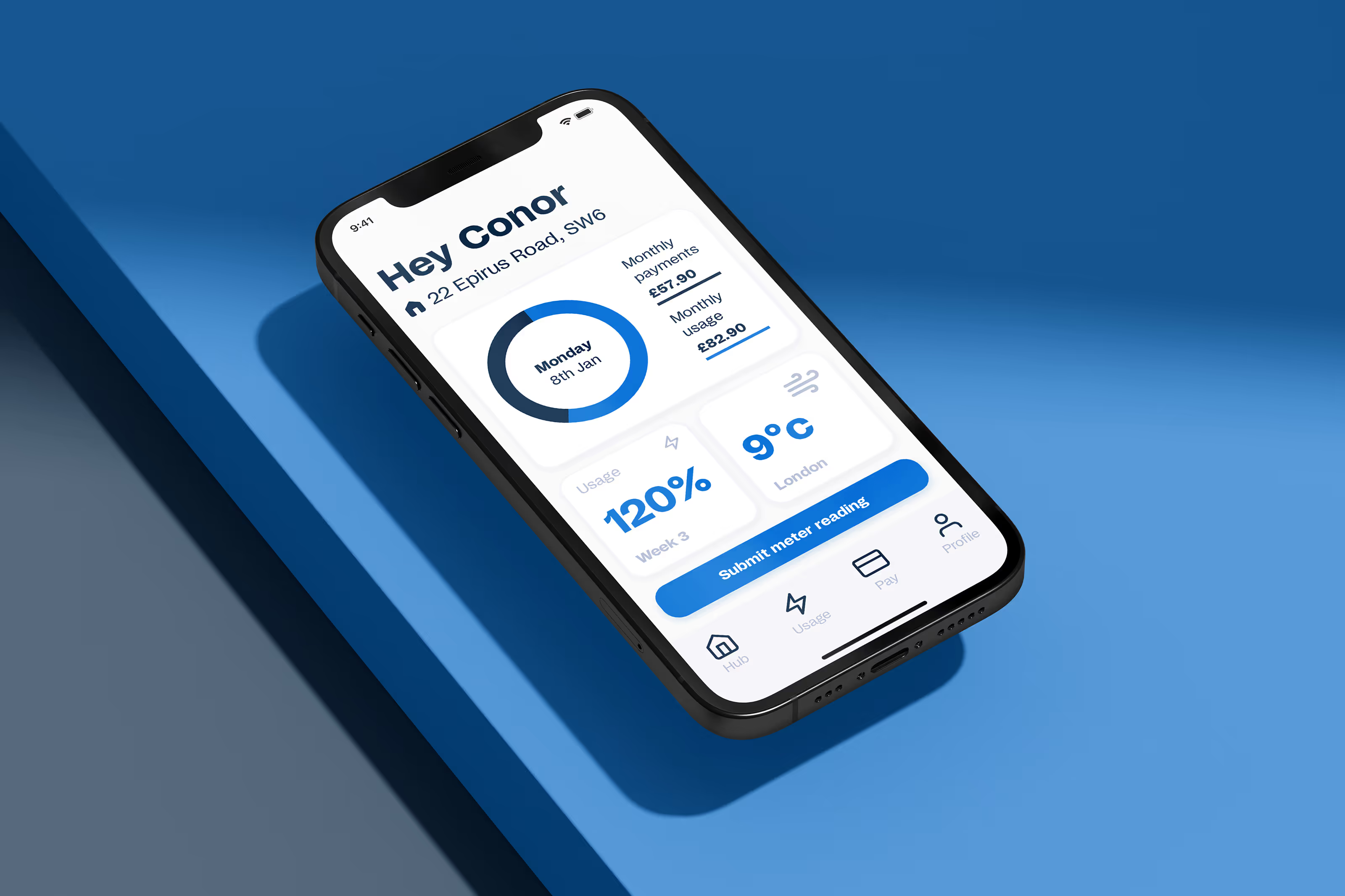
Centralising data and finances with a unique look and feel for Round Treasury's first rebrand.
03


.svg)


